
Corporate Brochure Design for a Building Surveyor in Singapore
Category:
Published Date: Sep 28, 2026
Building Surveyor Brochure Design Singapore: Project Overview
This building surveyor brochure design Singapore project was developed as a professional corporate presentation for a company operating in the building surveying sector.
Unlike a simple promotional flyer, a corporate brochure often needs to communicate several layers of information within one consistent document. It may introduce the business, explain its capabilities, present company credentials and provide supporting information that helps prospective clients understand the organisation more clearly.
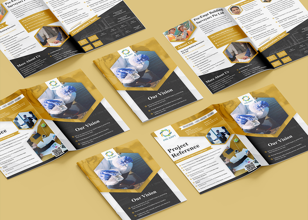
For this project, the brochure incorporates company information, corporate messaging, project references and organisational content within a coordinated multi-page layout.
The challenge was therefore not simply to make individual pages visually attractive. The brochure needed to maintain a consistent visual identity from cover to internal spreads while allowing different types of information to remain easy to distinguish.
The Subraa Team provides professional brochure design services in Singapore for companies requiring structured marketing and corporate presentation materials.
Presenting a Professional Building Surveying Business
Building surveying is a professional service, and the visual presentation needed to reflect that corporate environment.
The design avoids an overly decorative approach and instead uses a structured composition with strong geometric divisions, carefully positioned imagery and clearly separated content areas.
The brochure incorporates sections that visibly include areas such as:
- company introduction
- company vision
- project references
- organisation chart
- company information
- supporting service or corporate content
This gives the brochure the character of a company profile rather than a short-term promotional leaflet.
For professional service businesses, that distinction matters because the brochure may be used during introductions, presentations, meetings or other situations where potential clients want to understand more about the organisation.
Organising Information Across Multiple Brochure Pages
One of the most important considerations in a multi-page brochure is information hierarchy.
When several pages contain different types of material, presenting every section in exactly the same way can make the document repetitive. At the same time, changing the layout too dramatically between pages can make the brochure feel disconnected.
The design therefore uses recurring visual elements while allowing individual spreads to serve different purposes.
Large photographic areas provide visual interest, while clearly defined text sections create space for more detailed corporate information.
Smaller visual blocks, geometric frames and highlighted headings help divide content into manageable sections.
This approach gives each page its own function while maintaining consistency across the complete brochure.
Businesses preparing printed collateral can also refer to our guide to brochure sizes and dimensions in Singapore, which explains common brochure formats and considerations when planning the physical structure of a brochure.
Gold, Black and White Corporate Colour Direction
The brochure uses a prominent combination of gold, black and white.
Gold provides the strongest accent colour across the design and is used in backgrounds, headings, geometric sections and supporting elements.
Black creates visual weight and provides contrast, particularly in sections containing corporate information.
White areas introduce breathing space and help prevent the overall composition from becoming too visually dense.
Together, the three colours establish a professional corporate presentation while giving the brochure a recognisable visual identity.
Rather than applying the colours equally to every section, the design varies the balance between light and dark areas depending on the content being presented.
This creates visual rhythm across the brochure spreads.
Using Geometric Shapes to Structure the Brochure
Geometric framing is one of the more distinctive characteristics of this brochure design.
Angled and polygonal shapes appear throughout the spreads, particularly around imagery and major content areas.
These shapes serve more than a decorative purpose.
They help:
- separate photography from text
- highlight individual content blocks
- create visual movement
- establish consistency across different pages
- guide attention toward important sections
Using repeated geometric treatments also helps connect the cover, company profile pages and project-related sections as parts of the same corporate document.
The result is a brochure that feels designed as one system rather than a collection of independently styled pages.
Balancing Corporate Photography and Written Content
Corporate brochures frequently contain a considerable amount of written information.
If every page consists mainly of paragraphs, the brochure can become difficult to scan. On the other hand, using too much photography may leave insufficient space for important company information.
This design balances the two.
Large professional images are used to establish context and provide visual breaks, while dedicated content areas allow the business information to remain prominent.
Smaller supporting images are also incorporated where appropriate, creating additional points of interest without dominating the layout.
The balance between imagery and text helps make the brochure suitable both for quick browsing and for readers who want to study individual sections in more detail.
Designing the Company Vision Section
One of the visible brochure spreads focuses on the company's vision.
Rather than treating this as a standard text page, the design gives the section a stronger visual identity through the combination of a prominent image, dark background and contrasting text.
This helps separate broader corporate messaging from more practical information elsewhere in the brochure.
Vision and positioning content can be important within a company profile because it gives readers additional context about how the organisation presents itself beyond its list of services.
Giving this information its own visual treatment helps reinforce its importance without requiring excessive copy.
Presenting Project References Clearly
The brochure also includes a dedicated Project Reference section.
For businesses operating in technical, construction, surveying or professional service sectors, project references can be an important part of corporate presentation material.
They allow prospective clients to understand the type of work associated with the business and provide additional context beyond general service descriptions.
The project reference section is given a structured layout that separates the heading, supporting imagery and detailed content.
This makes the information easier to scan while maintaining consistency with the broader visual direction of the brochure.
Incorporating an Organisation Chart
The visible brochure design also includes an Organisation Chart.
Organisation charts contain a very different type of information from marketing copy or photography.
They need clarity, spacing and visual structure so that relationships between different positions or departments can be understood quickly.
The organisation chart uses a darker background with contrasting gold and light-coloured blocks, helping distinguish it from adjacent sections while remaining consistent with the brochure's overall colour palette.
This demonstrates why corporate brochures often benefit from flexible page layouts rather than repeating one fixed template across every page.
Different information requires different presentation methods.
Typography and Content Hierarchy
Typography plays an important role throughout a multi-page corporate brochure.
Major headings need to remain clearly distinguishable from body copy, project details and supporting information.
The design uses prominent headings for sections such as:
Our Vision
Project Reference
Organisation Chart
About Us
These headings provide clear entry points as readers move through the brochure.
Supporting text is presented at a smaller scale, allowing the hierarchy between headings, subheadings and detailed information to remain apparent.
This makes the brochure easier to browse while maintaining a professional corporate appearance.
Designing Brochures for Professional Service Companies
Professional service companies often need brochures for a different reason than retail or consumer brands.
Rather than focusing primarily on a single offer or promotion, the brochure may need to introduce:
- the company
- its background
- areas of expertise
- organisational capabilities
- selected projects
- credentials
- service information
That means the design must support more detailed communication while still remaining visually engaging.
A well-organised brochure can help turn a large amount of company information into a structured document that is easier for potential clients and business partners to navigate.
For businesses planning a new brochure, our guide on how to design an attractive brochure for your business provides additional considerations around brochure structure, imagery and presentation.
Brochure Design for Print and Digital Presentation
A professionally designed corporate brochure can serve several purposes.
Depending on how the company intends to distribute it, the same core design can support printed presentation materials as well as digital PDF distribution.
Corporate brochures may be used during:
- client meetings
- business introductions
- tender or proposal support
- networking
- exhibitions
- email communication
- website downloads
For a company profile brochure in particular, maintaining clear structure and consistent branding is important because readers may encounter the document independently from the company's other marketing materials.
The Subraa Team therefore approaches brochure layouts as complete communication pieces rather than simply decorating individual pages.
Final Brochure Design Direction
The completed brochure combines:
- a professional multi-page corporate layout
- gold, black and white visual styling
- geometric framing
- corporate photography
- clearly separated information areas
- company profile content
- vision and organisational information
- project reference presentation
- consistent typography and visual hierarchy
Together, these elements create a structured corporate brochure suitable for presenting a professional building surveying business.
The finished visual direction balances technical and corporate information with a polished presentation, allowing the brochure to communicate substantial business information without relying on a text-heavy appearance.
Visitors can also explore the broader Subraa portfolio to view other brochure, flyer, branding and digital design projects completed across different industries.
Brochure Design for Singapore Businesses
Every brochure serves a different purpose.
A building surveying company may require detailed corporate credentials and project references, while another business may need a product catalogue, service brochure, company profile or shorter promotional piece.
The layout, page structure and visual hierarchy should therefore be determined by the information the brochure needs to communicate rather than applying the same template to every project.
The Subraa Team creates custom brochure designs for Singapore businesses based on their supplied content, branding, intended audience and marketing requirements.