
Corporate Brochure Design for a Building Inspection & Surveying Company in Singapore
Category:
Published Date: Sep 29, 2026
Building Inspection Brochure Design Singapore: Project Overview
This building inspection brochure design Singapore project was developed for a company providing professional building surveying, investigation and consultancy services.
The client highlighted the principal consultants’ experience in Water Defects Investigation as a key strength, making this an important part of the brochure’s positioning.
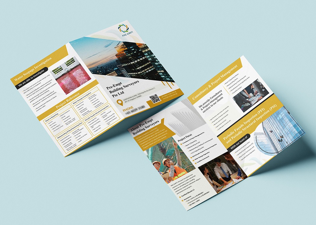
The finished brochure also presents services such as consultancy and project management, Periodic Façade Inspection and Periodic Structural Inspection, alongside project references and company information.
Because the subject matter is technical and professionally oriented, the design needed to communicate credibility and clarity without becoming visually heavy or overly corporate.
The Subraa Team approached the brochure as a structured company presentation rather than a simple promotional leaflet.
For businesses requiring professional corporate collateral, our brochure design services in Singapore cover custom layouts developed around each company’s content, branding and intended audience.
Understanding the Client's Brochure Brief
The client provided clear direction for the visual and communication style.
They wanted the brochure to:
- follow the existing website branding
- use the existing website colours
- use a portrait orientation
- communicate confidence and quality
- maintain a customer-oriented tone
- appeal to an audience aged over 40
- combine the company’s own photography with suitable stock imagery
These requirements gave the Subraa Team a strong framework for the brochure design.
Rather than introducing a completely new graphic style, the brochure needed to extend the company’s existing visual identity into a professional print format.
Designing for a Professional Building Surveying Audience
The intended audience was described as being over 40 years old, which influenced the need for a more mature and structured presentation.
For this type of audience, clarity and confidence are generally more important than excessive decorative styling.
The brochure therefore uses:
- clear section headings
- structured content areas
- strong visual hierarchy
- professional photography
- limited decorative elements
- consistent brand colours
This creates a presentation that feels informative and credible while still being visually engaging.
Presenting Water Seepage Investigation Services
Water defects investigation was identified in the client brief as a principal area of experience.
The brochure gives this service a dedicated section, helping readers quickly understand that water seepage investigation is an important part of the company’s expertise.
Photographic examples are used alongside supporting text to provide visual context.
This is especially helpful for technical services because readers may understand the nature of the problem more quickly when the written explanation is supported by relevant imagery.
The result is a section that communicates both technical capability and practical application.
Consultancy and Project Management Presentation
Another visible section focuses on Consultancy & Project Management.
This content is presented separately from the inspection-related services, helping the brochure communicate that the company’s role is not limited to physical inspection work.
By dividing the content into distinct service sections, the brochure makes the company’s broader professional capabilities easier to understand.
This structure also helps prevent the brochure from becoming a dense block of technical information.
Each service area is given its own visual space, allowing readers to scan the brochure and identify relevant services more quickly.
Periodic Façade and Structural Inspection
The brochure also highlights:
Periodic Façade Inspection (PFI)
and
Periodic Structural Inspection (PSI)
These services are presented with their own imagery and supporting content.
For technical professional services, abbreviations such as PFI and PSI may be familiar to some readers but less obvious to others.
Using the full service name alongside the abbreviation makes the brochure more accessible while still retaining the terminology used within the industry.
This helps the brochure communicate effectively to both technical and non-technical stakeholders.
Organising Project References
Project references occupy an important part of the brochure.
For a building surveying or consultancy company, showing project experience can help readers understand the range of work associated with the business.
Rather than presenting project references as one long list, the design organises them into clear visual blocks.
This makes the information easier to scan while still allowing multiple projects or categories to be presented within a limited amount of space.
The structure supports the broader professional tone of the brochure without making the page feel text-heavy.
Following the Existing Website Branding
The client specifically requested that the brochure follow the website and use the existing website colours.
This is an important part of the project.
Instead of creating a brochure with an unrelated colour palette or graphic style, the Subraa Team extended the existing identity into the printed format.
The brochure therefore uses a combination of:
- gold accents
- white backgrounds
- darker text areas
- brand-aligned graphic elements
- clean photography
Maintaining this visual continuity helps the brochure feel connected to the company’s broader brand rather than functioning as a standalone design.
Gold, White and Neutral Colour Direction
The design uses gold as the primary accent colour.
Gold appears in headings, borders, section backgrounds and supporting visual elements.
White provides the main background and helps the technical content remain readable.
Darker text colours provide contrast and help maintain a professional appearance.
Because the client requested the brochure to follow the website colours, the palette is not arbitrary. It reflects the existing brand direction rather than introducing a new visual identity.
Combining Client Photography and Stock Imagery
The client indicated that the brochure could use a combination of the company’s own photography and stock imagery.
This allows the design to balance authenticity with visual quality.
Client-supplied images can show real projects, environments or work carried out by the company.
Stock imagery can then support sections where appropriate photography may not already be available.
The important part is ensuring that both types of imagery feel visually consistent within the brochure.
The design uses framing, cropping and colour balance to help different image sources work together as part of one cohesive document.
Portrait Orientation and Content Flow
The client specifically preferred a portrait orientation.
Portrait brochures are particularly suitable for company profiles and service presentations because they provide a familiar reading format and allow content to flow naturally from top to bottom.
For this project, the portrait format supports:
- service descriptions
- project references
- photography
- contact information
- corporate profile content
Businesses deciding between brochure formats can also refer to our brochure sizes and dimensions in Singapore guide, which covers common brochure sizes, orientations and fold types.
Typography and Readability
The brochure uses a clear heading structure to separate different service areas.
Larger headings identify key sections such as:
Water Seepage Investigation
Consultancy & Project Management
Periodic Façade Inspection
Periodic Structural Inspection
Smaller supporting copy provides the detail.
This hierarchy helps readers move through the brochure without having to read every paragraph in sequence.
For a professional audience, readability is particularly important because the brochure may be used during meetings, consultations or business introductions where information needs to be understood quickly.
Designing for Confidence, Quality and Customer Orientation
The client described the desired tone as:
Confident
Quality
Customer oriented
The design direction supports these qualities through a controlled, structured layout rather than an overly promotional style.
Confidence is reflected through strong headings and clear organisation.
Quality is communicated through professional imagery, consistent spacing and visual balance.
Customer orientation is supported by presenting the services in a way that helps readers understand what the company offers without unnecessary complexity.
The result is a brochure that feels informative rather than sales-heavy.
Using a Clear Grid for Technical Content
Technical brochures often contain more information than promotional flyers.
Without a strong grid, the content can quickly become difficult to follow.
This design uses defined columns, image blocks and aligned content areas to keep the information organised.
The use of grids is also something we discuss in our guide on how to design an attractive brochure for your business, where layout structure, imagery, spacing and audience considerations are highlighted as important parts of brochure design.
Supporting Both Corporate and Technical Communication
The brochure needs to perform two functions at the same time.
It has to introduce the company professionally while also presenting technical services.
A purely corporate brochure could feel too general.
A purely technical document could become difficult for broader business audiences to engage with.
This layout balances both by combining:
- corporate branding
- technical service information
- project references
- photography
- contact details
This makes the brochure suitable for business development as well as more detailed service discussions.
Brochure Design for Professional Services Companies
Professional services companies often need brochures that communicate expertise, services and project experience without relying on aggressive promotional messaging.
Building surveyors, consultants, engineers and technical service providers may need to explain complex services clearly while still maintaining a strong corporate presentation.
The layout should therefore support:
- professional credibility
- easy navigation
- detailed information
- clear hierarchy
- brand consistency
The Subraa Team approaches brochure design around the actual content and audience rather than applying one fixed template across every industry.
Visitors can explore more work through the broader Subraa portfolio, which includes brochure, flyer, logo, name card and website projects across different sectors.
Final Brochure Design Direction
The completed brochure brings together:
- building surveying and inspection services
- water seepage investigation content
- consultancy and project management information
- PFI and PSI service presentation
- project references
- portrait orientation
- website-aligned branding
- gold and white corporate styling
- client and stock imagery
- structured typography
- professional content hierarchy
The final result reflects the client’s requested tone of confidence, quality and customer orientation while presenting technical information in a clear and professional format.
Brochure Design for Singapore Businesses
Every brochure has a different communication objective.
Some businesses need a product brochure, while others require a company profile, technical brochure or professional service presentation.
For this project, the Subraa Team developed a brochure that extended the company’s existing website identity into a structured print format while presenting technical services in a way that remained clear and approachable.
The Subraa Team creates custom brochure designs for Singapore businesses based on their supplied content, branding, audience and intended communication requirements.