
Corporate Brochure Design for a Logistics Company in Singapore
Category:
Published Date: Oct 01, 2026
Logistics Brochure Design Singapore: Project Overview
This logistics brochure design Singapore project was developed for a company operating in the logistics and freight sector.
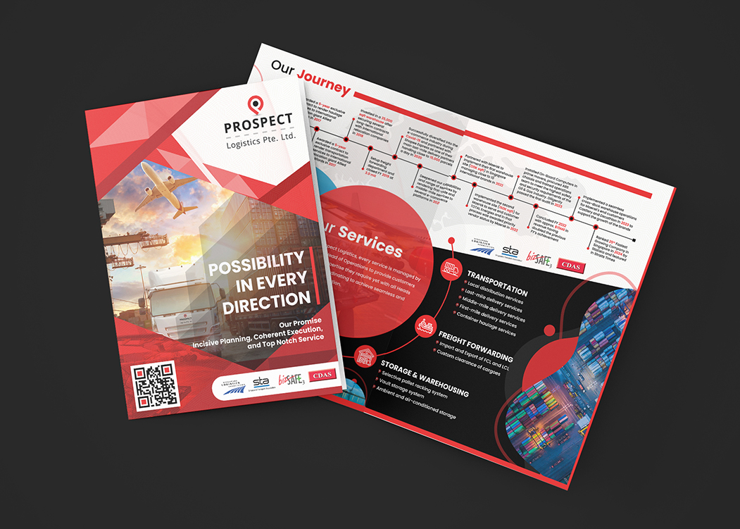
The brochure visibly presents several core business areas, including:
- transportation
- freight forwarding
- storage and warehousing
It also includes a dedicated Our Journey section, helping the brochure function as more than a short promotional leaflet.
The design needed to present both company information and service details within one coordinated corporate document.
The Subraa Team therefore approached the brochure as a structured business profile, using clear visual sections to separate company history, service categories and supporting logistics information.
Businesses requiring similar materials can explore our brochure design services in Singapore.
Presenting a Logistics Company Professionally
Logistics companies often need to communicate a broad range of services within a single document.
Potential customers may want to understand:
- what the company does
- what transport services are available
- whether freight forwarding is provided
- whether warehousing is available
- the company’s background
- the scale and scope of its operations
Trying to place all of this information into one visually flat layout can make a brochure difficult to navigate.
The design therefore uses clearly defined sections so readers can move between company information and individual service categories more easily.
Strong Cover Design for Immediate Industry Recognition
The cover combines several visual cues associated with logistics.
These include:
- aircraft
- cargo handling
- road transport
- freight infrastructure
- industrial imagery
The large headline:
POSSIBILITY IN EVERY DIRECTION
creates a strong focal point across the lower section of the cover.
Below it, the supporting promise:
Incisive Planning, Coherent Execution, and Top Notch Service
adds a more corporate layer to the visual presentation.
The overall cover therefore balances brand messaging with immediate industry context.
Using Transport Imagery to Establish Context
The cover imagery makes the sector clear before the reader reaches the internal pages.
Air freight and road transport visuals help communicate that the company works across different logistics modes.
This is particularly useful in a corporate brochure because the reader can identify the broad nature of the business quickly.
Rather than relying only on abstract graphics, the brochure uses recognisable logistics imagery to support the company positioning.
Red, Black and White Visual Direction
The brochure uses a strong combination of:
- red
- black
- white
Red appears throughout the design as a dominant accent.
It is used in:
- geometric cover graphics
- section highlights
- service icons
- headings
- timeline elements
- curved internal shapes
Black creates depth and gives the internal service sections a more corporate appearance.
White provides contrast and helps maintain readability.
The result is a strong visual identity that works well with the industrial and logistics subject matter.
Geometric Cover Graphics
The cover uses layered polygonal and angular red shapes.
These create movement and help frame the photographic content.
The geometric styling also adds a contemporary corporate feel without distracting from the transportation imagery.
This is useful for a logistics brand because the design can feel modern and dynamic while still remaining professional.
The red geometry becomes a repeated visual language rather than a one-off decorative treatment.
Presenting the Company Journey
One of the visible internal sections is titled:
Our Journey
This section uses a horizontal timeline to present the company’s development over time.
Timeline layouts can be particularly useful in company brochures because they allow several milestones to be shown within one organised structure.
Instead of presenting the history as a long paragraph, the brochure uses:
- dates
- milestone points
- short descriptions
- directional flow
This makes the information easier to scan.
It also gives the company’s development a clearer sense of progression.
Designing a Corporate Timeline
The timeline runs across the upper portion of the internal spread.
Red dots and connecting lines help establish the chronological sequence.
This creates a visual link between different periods or achievements.
For a logistics business, a timeline can help demonstrate continuity, development and business milestones without requiring a full page of text.
The use of visual markers also makes the content more engaging than a standard company-history paragraph.
Presenting Transportation Services
The brochure includes a dedicated Transportation section.
The visible service points indicate a structured approach to presenting logistics capabilities rather than simply naming the service.
Using a separate service heading helps readers quickly identify areas relevant to their own requirements.
Transportation is visually separated from the other core service categories, which reduces the risk of the brochure becoming one large undifferentiated service list.
Presenting Freight Forwarding Services
A separate section is dedicated to:
Freight Forwarding
This gives the service its own prominence within the brochure.
Freight forwarding often involves multiple processes, so using a dedicated section allows the business to communicate the offering without crowding the transportation content.
The accompanying icon and layout structure help distinguish this service visually while still keeping it consistent with the broader brochure design.
Storage and Warehousing Services
The brochure also features:
Storage & Warehousing
This section communicates that the company’s service offering extends beyond transportation and forwarding.
The supporting imagery of stacked shipping containers reinforces the broader logistics and storage environment.
Visually separating warehousing from transportation also helps potential customers understand the company as a more complete logistics provider rather than only a transport operator.
Using Service Icons for Faster Navigation
Each major service category uses a dedicated icon.
This supports faster scanning.
The reader can move quickly between:
- transportation
- freight forwarding
- storage and warehousing
without relying exclusively on text headings.
Service icons are particularly useful in brochures that contain several business areas because they create consistent visual anchors across the page.
Balancing Corporate Information and Service Content
A logistics brochure often needs to do two jobs at once.
It needs to introduce the company while also explaining the services.
If the brochure focuses only on the business story, customers may struggle to understand the actual service offering.
If it focuses only on services, the brochure can feel more like a sales sheet than a corporate profile.
This design balances both by combining:
- company journey
- corporate positioning
- service categories
- logistics photography
- brand messaging
That gives the brochure a more complete business presentation.
Typography and Content Hierarchy
The typography is clear and strongly hierarchical.
Large headings are used for sections such as:
Our Journey
Our Services
Transportation
Freight Forwarding
Storage & Warehousing
Supporting text is kept smaller and positioned beneath each service area.
This makes the document easier to browse.
For business readers, a clear hierarchy is particularly important because they may be looking for specific capabilities rather than reading every paragraph from start to finish.
Designing for a B2B Logistics Audience
Corporate logistics brochures are primarily information tools.
They may be used during:
- client introductions
- sales meetings
- business development
- proposals
- networking
- tender support
- exhibitions
- email distribution
That means the brochure needs to remain professional and easy to understand.
The visual style should support the company’s credibility without overwhelming the actual service information.
This project achieves that by combining strong branding with organised service content.
Using a Brochure to Explain Multi-Service Businesses
Multi-service companies often benefit from brochures because a single document can explain several capabilities together.
A logistics business may need to show how:
- transportation
- freight forwarding
- warehousing
- storage
- operational support
fit within one broader service offering.
A brochure gives these areas enough room to be presented individually while still keeping them connected to the same brand.
Businesses planning a similar document can refer to our guide on brochure sizes and dimensions in Singapore when deciding on page format and print structure.
Maintaining Visual Consistency Across Pages
The brochure uses repeated visual elements across the cover and internal spread.
These include:
- red accent shapes
- black backgrounds
- white typography
- circular service graphics
- logistics imagery
- consistent red-and-black section styling
This gives the document continuity.
Even though different pages serve different purposes, they still look like part of the same brochure.
That consistency is especially important in multi-page corporate collateral.
Designing a Brochure Around Real Business Information
A strong brochure should not depend only on attractive graphics.
Its effectiveness also depends on how well the business information is organised.
In this project, the company journey and major service categories are each given their own visual treatment.
That helps the brochure communicate substantial information without making every section feel identical.
Our article on how to design an attractive brochure for your business is relevant here because layout structure, imagery and hierarchy are especially important when presenting several corporate sections within one document.
Final Brochure Design Direction
The completed brochure brings together:
- logistics-focused imagery
- transportation services
- freight forwarding services
- storage and warehousing services
- a corporate journey timeline
- bold red, black and white styling
- geometric cover graphics
- service icons
- clear typography
- structured information hierarchy
The result is a professional corporate brochure that presents the company’s logistics capabilities while also giving readers context about the organisation itself.
Visitors can explore additional design projects across other industries through the Subraa portfolio.
Brochure Design for Logistics Companies in Singapore
Logistics businesses often have multiple service areas that need to be communicated clearly within one professional document.
A brochure can provide enough space to present:
- company background
- transport capabilities
- freight services
- warehousing
- business milestones
- contact information
without forcing all of the content into a single promotional page.
For this project, the Subraa Team developed a structured corporate brochure that combines company information, logistics imagery and core service categories within one consistent visual system.