
Corporate Name Card Design for a Data & Technology Business in Singapore
Category:
Published Date: Sep 29, 2026
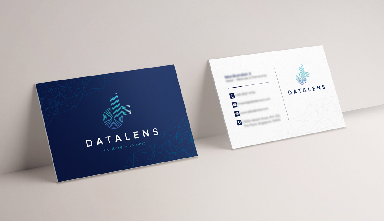
Data & Technology Name Card Design Singapore: Project Overview
This data technology name card design Singapore project was developed for a business with a strong data-oriented and technology-focused brand identity.
Although a name card is physically small, it needs to communicate several important pieces of information at once. The company identity should be immediately recognisable, contact details need to remain easy to find, and the overall design should feel consistent with the broader brand.
For this project, the Subraa Team developed a two-sided name card that separates branding from detailed contact information.
The darker front places strong emphasis on the logo and company positioning, while the lighter reverse side provides a structured space for the individual's professional details.
This separation allows both sides of the card to serve a clear purpose rather than trying to fit every piece of information into one crowded layout.
Businesses requiring professionally structured business cards can explore the Subraa Team's name card design services in Singapore, which cover custom corporate name card layouts and print-ready design files.
Creating a Modern Identity for a Data-Focused Business
The visual identity shown in the finished card has a distinctly modern and technology-oriented character.
The brand mark is constructed from fine linear forms, while the tagline:
DO MORE WITH DATA
reinforces the data-related positioning.
Rather than introducing unrelated decorative elements, the name card extends this existing visual language across the card.
Fine geometric line patterns appear around the corners and edges of the design, complementing the structured nature of the logo.
This helps the name card feel like part of the same brand system rather than a separate piece of marketing collateral.
Designing the Front of the Name Card
The front side follows a deliberately restrained approach.
The main elements are:
- company logo
- business name
- tagline
- geometric background graphics
- deep blue brand background
There are no contact details competing with the identity on this side.
This gives the logo considerably more visual presence and allows the front to function almost like a compact brand card.
The large amount of negative space around the logo is equally important.
Rather than filling every available area, the design allows the central identity enough room to stand out.
For technology and professional service brands, this type of controlled layout can communicate more effectively than adding unnecessary visual elements purely to fill the card.
Structuring the Contact Information
The reverse side performs a different role.
Instead of repeating the dark visual treatment, the design moves to a predominantly white background.
This immediately improves differentiation between the two sides.
The contact information is grouped within a clear column, supported by small icons representing details such as:
- telephone
- website
- location
The logo and company identity remain visible on the opposite side of the layout, separated by a thin vertical divider.
This creates a clear information hierarchy.
The recipient can quickly identify the cardholder's professional information while the company branding remains consistently present.
Balancing Branding and Practical Information
A name card is both a branding item and a practical communication tool.
If the branding dominates too strongly, important contact information can become difficult to locate.
If the design concentrates entirely on contact details, however, the card can look generic and lose the character of the company.
This project balances those functions by giving each side a different responsibility.
The front concentrates on recognition and visual identity.
The reverse concentrates on communication and professional details.
The result is a name card that can present the company visually before providing the information needed for future contact.
Subraa's detailed business card design guide also discusses elements such as card size, typography, contact information, logo placement, colours and print preparation when planning a professional business card.
Deep Blue and Turquoise Colour Direction
Colour is one of the strongest characteristics of this design.
The front uses a deep navy blue background that provides a professional and technology-focused foundation.
Turquoise and lighter blue tones are used within:
- the logo
- tagline
- geometric linework
- supporting brand accents
The lighter cyan tones stand out clearly against the darker background while maintaining a cohesive relationship with the central identity.
On the reverse side, the same branding colours are used much more selectively.
The predominantly white background creates a cleaner environment for the contact information, while the logo preserves the connection with the darker front.
This front-dark / back-light approach also makes the two sides visually distinct without making them feel like unrelated designs.
Using Geometric Graphics to Extend the Brand
One of the more distinctive aspects of the name card is the network-style geometric pattern.
Fine connected lines form abstract polygonal shapes around portions of both sides of the card.
These patterns complement the linear construction of the logo and reinforce the visual theme without overpowering the information.
In a data or technology-related identity, geometric line structures can visually suggest ideas such as:
- connections
- networks
- information
- systems
- digital structure
However, in this project, their most important role is visual consistency.
Because the pattern shares the same fine-line character as the logo, it feels integrated with the identity instead of being added as unrelated decoration.
Logo Placement and Brand Recognition
The company logo receives strong prominence on both sides.
On the dark front, the identity appears centrally with significant surrounding space.
On the lighter reverse, it is positioned separately from the contact-information column.
Repeating the logo serves a practical purpose.
Regardless of which side of the name card a recipient first sees, the company identity remains immediately visible.
This is particularly useful when cards are placed on tables, stored with other business cards or exchanged during meetings and networking sessions.
A name card should support the wider brand identity rather than operate independently from it.
For businesses still developing their visual identity, the Subraa Team's logo design services in Singapore can establish the core branding before related collateral such as name cards is developed.
Typography and Information Hierarchy
Typography is intentionally clean and understated throughout the design.
The company name uses generous spacing between characters, giving the identity a contemporary corporate appearance.
The tagline appears considerably smaller so that it supports rather than competes with the company name.
On the contact-information side, the cardholder's name and designation occupy a stronger position than the secondary details underneath.
This creates a logical reading order:
person's name ? designation ? contact details ? company identity
Small icons beside the contact information help individual details remain easy to distinguish without requiring additional labels.
The resulting hierarchy keeps the reverse side organised even though it contains considerably more information than the front.
Designing a Double-Sided Name Card
Using two sides effectively gives a designer more flexibility.
Instead of treating the reverse as simply another place to repeat the same information, each side can have its own function.
In this project:
Front:
Brand recognition and visual identity.
Back:
Professional and contact information.
This approach reduces clutter and allows the card to feel more deliberate.
It also gives recipients a stronger first visual impression while retaining all of the practical details expected from a professional name card.
Why White Space Matters on a Name Card
Because business cards have limited physical space, there can be a temptation to fill every available area.
This often makes the design harder to read.
The Datalens design uses substantial empty space, particularly around the logo on the front and between information groups on the reverse.
This allows the content to breathe.
White or negative space does not mean unused space. It helps establish separation, hierarchy and visual emphasis.
On a professional name card, these qualities can be particularly important because contact details need to remain legible at a relatively small printed size.
Designing for Professional Networking
Name cards continue to serve a practical purpose during meetings, business introductions and networking situations.
The card needs to provide enough information for the recipient to reconnect with the person or organisation later while also reinforcing the company's professional identity.
Subraa's name card service page notes that typical business card information can include the person's name, job title, phone number, email, website and company information.
This project organises those functional details within a visual system that remains consistent with the company's data-focused branding.
The result is not simply a container for contact information, but a continuation of the broader corporate identity.
Preparing Name Card Artwork for Print
Visual design is only one part of preparing a professional name card.
Artwork intended for physical production also needs to account for considerations such as:
- final card dimensions
- bleed
- trim area
- safe margins
- typography size
- colour mode
- image resolution
Subraa's existing name card design guide recommends print considerations including bleed, trim and safety areas, 300 dpi artwork and CMYK preparation.
These technical considerations help ensure that a design created digitally can be reproduced effectively when sent for printing.
As with Subraa's other print-design services, the design work and print-ready files can be prepared for the client to arrange printing separately.
Maintaining Consistency Across Brand Collateral
A professional identity becomes stronger when its visual elements remain consistent across different applications.
The same logo, typography, colours and graphic language can potentially extend across:
- name cards
- letterheads
- brochures
- presentation materials
- websites
- social media graphics
- other corporate collateral
This is why the visual direction of a name card should generally support the wider identity rather than introducing a completely different style.
In this project, the repeated blue palette, linear logo styling and geometric graphics give the name card a strong sense of brand continuity.
Visitors can explore additional work by the Subraa Team through the Subraa design portfolio, which includes name card, logo, flyer, brochure, website and other design projects.
Final Name Card Design Direction
The completed name card brings together:
- a double-sided corporate layout
- prominent logo placement
- data and technology-inspired visual styling
- deep blue and turquoise branding
- geometric network graphics
- structured contact information
- clean icon-based details
- strong use of negative space
- clearly differentiated front and back designs
The darker front creates a strong brand-led first impression, while the lighter reverse provides a practical and readable information layout.
Together, both sides create a cohesive corporate name card that supports the company's existing identity without unnecessary visual complexity.
Name Card Design for Singapore Businesses
Different industries require different approaches to business card design.
A technology company may prefer a minimal and structured visual identity, while businesses in hospitality, retail, professional services or creative industries may require entirely different styling.
The objective should therefore be to translate the company's existing identity and information into a card that remains professional, readable and recognisable.
The Subraa Team creates custom name card designs for Singapore businesses based on their branding, supplied information and intended professional presentation.