
Corporate Name Card Design for a Safety Consultancy in Singapore
Category:
Published Date: Sep 29, 2026
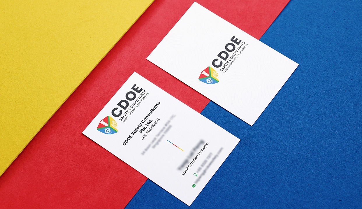
Workplace Safety Name Card Design Singapore: Project Overview
This workplace safety name card design Singapore project was developed for a safety consultancy business requiring a professional corporate identity for everyday business communication.
A name card for a consultancy needs to perform two functions at the same time. It should reinforce the company’s brand while also presenting practical contact information in a way that is clear and easy to read.
For this project, the Subraa Team developed a double-sided layout that separates the company branding from the more detailed contact information.
The front side focuses mainly on the logo and business identity, while the reverse side presents the individual’s professional details.
This creates a cleaner overall presentation than placing every piece of information on one side.
Businesses requiring similar collateral can explore our name card design services in Singapore.
Creating a Professional Identity for a Safety Consultancy
The company branding shown in the design has a strong safety and compliance-oriented visual character.
The logo uses multiple colours within a compact geometric symbol, while the company name and supporting text are presented in bold black typography.
The overall visual treatment is restrained and professional rather than decorative.
That is appropriate for a consultancy environment where credibility, clarity and trust are more important than excessive visual styling.
The name card therefore extends the company identity without introducing unrelated design elements.
Designing the Front of the Name Card
The front of the card is intentionally minimal.
It contains:
- the company logo
- business name
- supporting tagline
- subtle background pattern
- generous white space
This allows the brand identity to remain the main visual focus.
The company name is given strong prominence, while the smaller supporting text remains secondary.
The large amount of open space also helps prevent the design from feeling crowded.
For a professional services business, this kind of controlled layout can create a cleaner and more established impression.
Structuring the Contact Information
The reverse side contains more practical information.
The company identity remains visible near the upper portion, while the cardholder’s details are organised below.
The design uses a clear hierarchy so that the reader can identify:
company name ? individual name ? designation ? contact details
without having to search through multiple competing elements.
Small visual markers and spacing help divide the information into manageable groups.
This structure is especially important on a name card because the physical space is limited.
Using White Space to Improve Readability
White space is one of the strongest characteristics of this design.
Rather than filling the entire card with colour or graphics, the layout leaves substantial breathing space around the logo and text.
This improves readability and helps individual elements stand out.
On the reverse side, the contact details are given enough room to remain clear even at a small printed size.
The subtle background pattern adds some visual interest without competing with the information.
Our business card design guide also covers factors such as layout, typography, spacing and information hierarchy when preparing a professional business card.
Multi-Colour Branding with a Neutral Layout
The company logo contains several colours, including red, blue, yellow and green.
Instead of repeating all of these colours heavily throughout the name card, the design keeps the overall layout predominantly white.
This gives the logo more prominence and prevents the card from becoming visually busy.
Small colour accents can then support the identity without overwhelming the professional presentation.
This approach works particularly well for businesses whose logos already contain several colours.
The card does not need to repeat every brand colour equally.
Bold Typography for Corporate Clarity
The typography is straightforward and easy to read.
The company name uses a bold typeface that gives it visual authority.
Supporting details such as the tagline, cardholder name, designation and contact information are presented at smaller sizes to create a clear hierarchy.
The result is a card that feels professional without becoming overly formal.
For a safety consultancy, this kind of typography supports the overall sense of structure and reliability.
Supporting a Safety and Compliance-Focused Brand
The visible company identity suggests a business connected with safety consultancy and professional advisory services.
For companies working in safety, compliance or consultancy, the name card often becomes part of a wider corporate identity used across:
- reports
- proposals
- quotations
- training materials
- websites
- presentations
- signage
- email communication
- other business documents
The design therefore needs to remain consistent with the broader corporate brand.
This name card achieves that by keeping the logo, typography and overall visual direction clear and controlled.
Double-Sided Name Card Design
Using both sides of the card allows the information to be separated more effectively.
In this project:
Front side:
Brand identity and company recognition.
Back side:
Individual and contact information.
This division reduces visual clutter.
It also allows the front to function as a strong branding surface while the reverse remains practical.
For professional businesses, this approach can be more effective than trying to place the logo, tagline, name, designation, phone number, email, address and other information all on one side.
Designing for Professional Networking
Name cards continue to be useful in situations such as:
- client meetings
- consultations
- networking events
- corporate introductions
- training sessions
- conferences
- business development meetings
For a consultancy, the name card needs to feel credible and organised because it may be one of the first physical brand materials a potential client receives.
The clean design helps support that role.
A well-structured card can make it easier for recipients to identify the person, their role and the company they represent.
Keeping the Brand Consistent Across Corporate Materials
A name card should ideally support the wider brand identity rather than introduce a completely separate visual style.
The same logo, colours and typography may also appear across:
- letterheads
- reports
- proposals
- brochures
- websites
- PowerPoint presentations
- social media graphics
- other marketing collateral
Maintaining consistency across these materials helps create stronger brand recognition.
For businesses still refining their identity, the Subraa Team also provides logo design services in Singapore so the core brand can be established before supporting collateral is developed.
Preparing Name Card Artwork for Print
A name card design also needs to work correctly when printed.
Important production considerations can include:
- final card size
- bleed
- trim area
- safe margins
- CMYK colour mode
- text size
- image resolution
- print-ready PDF preparation
These technical details are particularly important because even a strong digital design can reproduce poorly if the artwork is not prepared correctly.
Our Ultimate Guide to Business Cards provides more information on planning and preparing professional business cards.
Final Name Card Design Direction
The completed design brings together:
- a professional double-sided layout
- clear safety consultancy branding
- strong logo placement
- bold corporate typography
- predominantly white visual styling
- subtle background graphics
- structured contact information
- generous white space
- clear front-and-back differentiation
The result is a professional name card that reinforces the company identity while keeping the practical information easy to access.
Visitors can explore more examples of business collateral created by the Subraa Team through the Subraa portfolio.
Name Card Design for Professional Services Businesses in Singapore
Professional services companies often require name cards that communicate credibility more than decorative styling.
A safety consultancy, accounting firm, engineering company or corporate advisory business may need a very different visual direction from a retail or creative brand.
The design should therefore respond to the company’s identity, audience and professional context.
For this project, the Subraa Team created a clean double-sided name card that combines corporate branding with practical communication in a clear, professional format.