
Pull Up Banner Design for an Ethnic Fashion Retail Shop in Singapore
Category:
Published Date: Sep 29, 2026
Ethnic Fashion Pull Up Banner Design Singapore: Project Overview
This ethnic fashion pull up banner design Singapore project was developed as a promotional display for a retail business specialising in traditional fashion and related products.
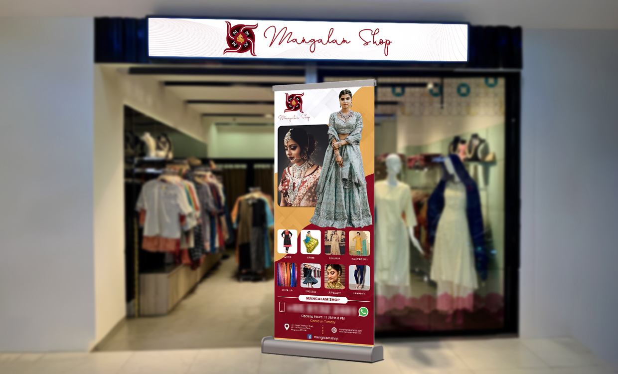
The finished artwork is shown directly in front of the shop, demonstrating how the banner works in an actual retail environment rather than only as a digital design.
A storefront pull up banner has a different role from a brochure or flyer. It needs to attract attention quickly, establish what the shop offers and provide enough visual information to encourage passing customers to take a closer look.
For this project, the Subraa Team created a vertical composition combining prominent fashion imagery, smaller product-category visuals, branding and practical contact information.
Businesses requiring similar displays can explore our pull up banner design services in Singapore for retail, exhibitions, promotions and other business applications.
Designing for a Retail Storefront Environment
A banner positioned outside or near a retail outlet competes with several visual elements at once.
Customers may already be looking at:
- shop signage
- window displays
- mannequins
- neighbouring shops
- promotional materials
- passing foot traffic
The banner therefore needs to communicate quickly.
In this design, the large model imagery occupies the upper portion of the layout, creating an immediate fashion-oriented visual cue.
Below this, smaller product images allow viewers to understand that the shop offers a wider range of traditional fashion items and accessories.
The structure creates a natural reading order:
brand ? fashion imagery ? product categories ? shop/contact information
This helps prevent the design from becoming a simple collection of unrelated product photographs.
Using Fashion Photography as the Main Visual Focus
The banner gives strong visual priority to model photography.
A full-length model wearing traditional attire creates the main focal point, while a second close-up image introduces jewellery and bridal styling.
This combination works particularly well for an ethnic fashion retailer because it allows the banner to communicate both clothing and accessory styling within one display.
Instead of using only product cut-outs, the photography shows how the fashion items can appear when worn.
That provides more lifestyle context and gives the overall design greater visual impact.
Presenting Multiple Product Categories Clearly
Retail businesses often need one promotional display to communicate more than a single product type.
The lower section of the banner includes a series of smaller visual blocks representing different categories.
Using images for these categories rather than lengthy descriptions makes the banner easier to scan from a distance.
This is particularly important for pull up banners because customers may only look at the display for a few seconds while passing the shop.
The categories are separated visually while remaining part of the same overall composition.
That allows the design to communicate variety without giving every product equal visual prominence.
Establishing a Strong Fashion Retail Hierarchy
The banner uses a clear hierarchy rather than treating all elements with the same visual weight.
The strongest elements are:
- brand identity
- main fashion imagery
- supporting product categories
- shop information and contact details
This hierarchy helps viewers understand the business before reaching the smaller practical information toward the bottom.
The larger imagery attracts attention first, while the detailed information remains available once the viewer moves closer.
This type of layered communication is particularly useful for retail displays.
Red, Gold and Cream Visual Direction
The design uses a warm combination of red, gold, cream and white.
Red creates the strongest brand and promotional accents.
Gold introduces a richer traditional character that complements the ethnic fashion imagery.
Cream and lighter areas help separate the photography from the stronger colour blocks and prevent the vertical layout from feeling too dark.
The overall palette also works naturally with the traditional attire and jewellery shown in the design.
Because the shop signage visible behind the banner also uses similar red branding, the banner feels visually connected to the storefront rather than appearing as an unrelated promotional item.
Connecting the Banner with the Shop Branding
One of the advantages of the supplied mockup is that we can see the banner within its intended environment.
The shop fascia above uses the same brand identity that appears on the banner.
Maintaining this consistency is important.
A customer seeing the banner first and then looking toward the shop should immediately recognise that both belong to the same business.
The repeated use of:
- logo
- brand colours
- fashion imagery
- typography
helps strengthen this connection.
Consistent branding across storefront signage and promotional materials can make the overall retail presentation feel more established.
Balancing Decorative Styling with Product Information
Fashion marketing often allows for more decorative visual treatment than highly technical industries.
However, a retail banner still needs to remain readable.
The design uses angled colour areas and image blocks to introduce movement without allowing decorative elements to dominate the products.
The clothing and jewellery remain the main focus.
This balance is important because visual styling should support the products being promoted rather than distracting from them.
Businesses working with other forms of promotional print can also refer to our guide on tips to make your flyer design stand out, where hierarchy, imagery and visual impact are also relevant considerations. Posts ‹ #1 Premier Freelance We…
Typography for a Fashion Retail Banner
The typography has several different functions throughout the layout.
The brand name receives its own visual treatment near the top.
Product categories are presented at smaller sizes beneath their respective imagery.
Practical information, including shop and contact details, is positioned toward the bottom.
The design therefore avoids using one typography scale throughout.
Instead, the text hierarchy supports the way customers are likely to view the banner:
recognise the brand ? notice the products ? read further information
For a vertical display, this makes the layout easier to understand than placing all information at similar sizes.
Using a Pull Up Banner for In-Store and Storefront Promotion
Pull up banners are particularly useful for retail environments because they are freestanding and can be repositioned when required.
A retailer can potentially use the same banner:
- near the shop entrance
- inside the retail space
- at promotional events
- during festive campaigns
- at pop-up locations
- at exhibitions
The design therefore needs to work independently from the permanent shop signage.
In this project, the banner includes enough brand and product information to remain understandable even if it is viewed away from the storefront.
Designing for Quick Customer Recognition
Retail promotional materials are often viewed very briefly.
Unlike a brochure, customers are unlikely to stop and read several paragraphs from a pull up banner.
The design therefore depends strongly on visual recognition.
Large fashion imagery communicates the type of business.
Smaller category images communicate product variety.
The brand logo identifies the shop.
Contact information supports the next step.
This is a good example of why display design needs to prioritise rather than simply include as much information as possible.
Supporting the Wider Retail Brand
A pull up banner can work alongside other branded materials such as:
- flyers
- brochures
- social media graphics
- shopping bags
- name cards
- storefront signage
- promotional posters
- digital advertisements
Maintaining the same logo, colours and general visual direction across these materials helps create a more consistent customer experience.
The Subraa Team also provides broader graphic design services for businesses requiring coordinated marketing materials across multiple formats.
Designing Promotional Materials for Fashion Businesses
Fashion-related promotional design needs to communicate visually before it communicates verbally.
Photography, styling, colour and composition therefore play an especially important role.
For ethnic fashion businesses, the visual presentation may also need to reflect details such as:
- traditional clothing
- jewellery
- occasion wear
- festive fashion
- cultural styling
The objective is not to fill every available space with products.
Instead, the strongest images should establish the overall impression first, while supporting visuals communicate range and variety.
This project follows that approach by giving the main model imagery significantly more prominence than the smaller product categories.
Final Pull Up Banner Design Direction
The completed design combines:
- ethnic fashion photography
- jewellery imagery
- multiple product-category visuals
- shop branding
- red, gold and cream styling
- prominent vertical composition
- practical shop information
- retail-focused visual hierarchy
The result is a promotional banner that communicates the nature of the shop quickly while still showing enough product variety to encourage further interest.
The storefront mockup also demonstrates how the finished design integrates with the physical retail environment.
Visitors can explore additional work created across different industries through the Subraa portfolio.
Pull Up Banner Design for Retail Businesses in Singapore
Different retail businesses need different types of promotional displays.
A fashion retailer may rely heavily on product photography, while a service provider, restaurant or technology company may need a completely different information hierarchy.
The design should therefore respond to the actual business, audience and promotional setting rather than using one fixed template.
For this project, the Subraa Team created a visually led pull up banner that combines ethnic fashion imagery, product variety and consistent storefront branding within a compact vertical format.