
EV Charger Pull Up Banner Design for an Energy Company in Singapore
Category:
Published Date: Sep 29, 2026
EV Charger Pull Up Banner Design Singapore: Project Overview
This EV charger pull up banner design Singapore project was developed for a company operating in the clean energy and electric vehicle charging sector.
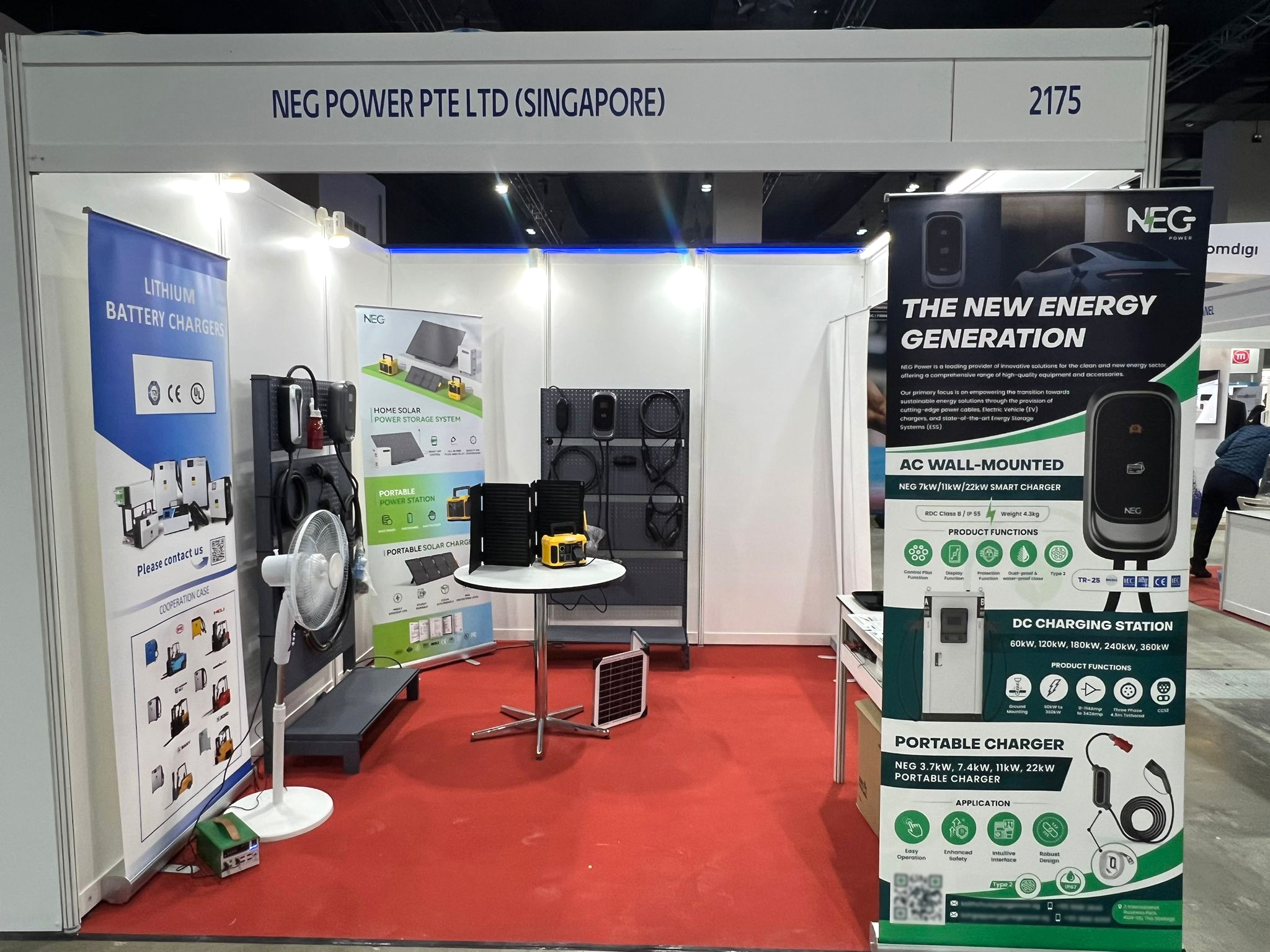
The finished banner is shown in use within an exhibition booth, where it forms part of a larger display featuring EV charging equipment, solar-related solutions, battery chargers and other energy products.
Unlike a flyer or brochure that is usually viewed at close range, a pull up banner needs to communicate its most important information quickly from a greater viewing distance.
For this project, the vertical banner presents several EV charging product categories within a limited amount of space while maintaining a clear visual hierarchy.
The Subraa Team provides custom pull up banner design services in Singapore for exhibitions, trade fairs, product launches and other promotional environments. Subraa's current pull-up-banner service page also positions these banners specifically for events, exhibitions and trade fairs.
Designing for an Exhibition Environment
An exhibition banner has to work differently from many other print marketing materials.
Visitors may see the display while walking past a booth, viewing it from several metres away or looking at it among numerous competing exhibition stands.
That means the design cannot depend entirely on detailed body copy.
Instead, the most important elements need to establish the subject quickly.
In this banner, the strong headline:
THE NEW ENERGY GENERATION
creates an immediate visual entry point.
Below this, the banner divides the product information into clearly identifiable charging categories:
- AC wall-mounted charger
- DC charging station
- portable charger
This allows visitors to understand the company's core EV charging offering before reading the smaller technical information.
Presenting Multiple EV Charging Products in One Banner
One of the main challenges in this design is the number of products that need to be represented.
A banner focusing on one charger could dedicate most of the space to one hero image and a small amount of supporting copy.
Here, however, the display needs to communicate several charging solutions.
The layout solves this by separating the content vertically.
The upper portion introduces the company and overall clean-energy positioning.
The middle section features the AC wall-mounted charger.
The next section presents the larger DC charging station.
The lower area introduces the portable charging solution.
This creates a logical top-to-bottom progression while allowing each product category to retain its own visual area.
Establishing Clear Product Hierarchy
For a technical product banner, information hierarchy is particularly important.
Visitors should be able to distinguish between:
product category
product image
power or capacity information
key features
supporting technical details
The design therefore uses larger typography for the product categories while placing specifications and feature icons at smaller sizes underneath.
This prevents the technical information from competing with the main product message.
The product images are also positioned prominently enough that viewers can recognise the physical charging equipment before examining individual specifications.
Using Product Photography as the Main Visual Focus
Large product visuals form an important part of the banner.
The AC charger is displayed against the darker upper section, while the DC charging station and portable charger are presented further down the banner.
For an EV charging company, this is useful because the products themselves are an important part of the marketing message.
Rather than relying on abstract illustrations of electricity or vehicles, the banner allows visitors to see what the charging equipment actually looks like.
The presence of a vehicle image near the upper portion adds immediate automotive context without taking attention away from the charging hardware.
Black, Green and White Colour Direction
The banner uses a strong black, green and white visual combination.
Black dominates the upper background and gives the design a modern, technology-oriented appearance.
Green is used as an accent throughout the banner and visually reinforces the broader clean-energy positioning.
White provides contrast and makes the larger headings and supporting information easier to identify against the darker background.
The three colours also help divide the vertical layout into different product zones without creating completely separate visual styles for each section.
This keeps the banner cohesive even though it contains several product categories.
Designing Product Information for Distance Viewing
Pull up banners are normally positioned vertically at standing height and need to remain readable in busy environments.
Subraa's current pull up banner service page lists 85 cm × 200 cm as a common standard size and emphasises readability from a distance, concise messaging and placing important information prominently.
Those principles are particularly relevant to a product-heavy exhibition banner.
In this design, the larger headings carry the key message while smaller technical details remain secondary.
The viewer can first identify:
EV charging
AC charging
DC charging
portable charging
and then move closer if they want to examine features or specifications.
This layered information structure is more practical than giving every piece of content equal prominence.
Using Feature Icons to Simplify Technical Information
The banner incorporates several small circular feature icons beneath the product sections.
These help break technical features into compact visual units.
For technology and engineering-related products, feature icons can be especially useful because they reduce the need for long explanatory sentences.
A viewer can scan several feature indicators quickly while still having access to supporting text where necessary.
The icon system also adds consistency across the different charger sections.
Even though the products vary considerably in size and application, the repeated feature presentation helps make them feel like part of the same product range.
Maintaining Brand Visibility at the Exhibition Booth
The exhibition photograph shows that the pull up banner is not being used in isolation.
It sits within a larger booth environment containing additional banners, products and display equipment.
That makes brand consistency particularly important.
The banner needs to remain visually connected to the surrounding booth materials while still being strong enough to work as an individual display.
The repeated use of dark tones, green accents and clean product imagery helps establish that connection.
The company branding remains visible toward the top of the banner, while the product content occupies the majority of the available vertical space.
This balance allows the banner to function as both a brand display and a product-information panel.
Supporting a Broader Exhibition Display
The photograph also illustrates an important consideration when designing marketing materials for exhibitions: the banner is only one part of the visitor experience.
The booth includes other display banners, charging products and energy-related equipment.
A pull up banner in this context should therefore complement the overall stand rather than attempt to communicate every piece of information available about the business.
The vertical display focuses specifically on EV charging solutions, while other booth materials appear to cover areas such as lithium battery charging, solar power storage and portable energy products.
This creates a clearer division of information across the exhibition space.
For businesses using multiple printed pieces at events, consistent design across banners, brochures, flyers and other marketing collateral can help create a more cohesive presentation. Subraa's broader graphic-design offering includes these types of print and promotional materials.
Typography for an EV Charging Banner
The typography uses bold uppercase headings throughout the design.
This is appropriate for an exhibition banner because the major messages need to remain identifiable from a distance.
Examples include:
THE NEW ENERGY GENERATION
AC WALL-MOUNTED
DC CHARGING STATION
PORTABLE CHARGER
The strong typographic hierarchy separates product categories clearly while preventing smaller technical details from dominating the composition.
The italic styling used in the main headline also gives the banner a more dynamic, technology-focused character.
Designing for a Technical B2B Audience
EV charging equipment is a technical product category.
Potential viewers at an exhibition may include business owners, installers, property representatives, infrastructure professionals, fleet operators or other industry participants.
The design therefore needs to maintain a professional appearance while still being visually engaging.
Too much decorative styling could distract from the equipment and specifications.
At the same time, a purely technical specification sheet would not have enough visual impact for an exhibition environment.
The final banner sits between these two extremes.
Large product images establish visual impact, while technical specifications, feature icons and charger capacities provide supporting information for viewers who want to understand the products in greater detail.
Pull Up Banner Design for Product Exhibitions
Product-focused pull up banners can be useful when businesses need to showcase several solutions within limited exhibition space.
Because the display is vertical and freestanding, it can be positioned near the entrance of a booth, beside demonstration equipment or in areas where wall-mounted graphics are not practical.
Subraa's pull up banner service page lists trade shows, exhibitions, conferences, product launches and similar promotional settings as common uses for this format.
For product-led companies, the design should normally prioritise:
- a clear headline
- recognisable product imagery
- concise product categories
- key specifications
- feature highlights
- branding
- contact or action information where appropriate
The exact hierarchy should still depend on the purpose of the banner and the amount of information supplied.
Creating Print Collateral Around the Same Brand
An exhibition banner often works best when it is supported by other marketing materials.
A visitor may first notice the banner from a distance and later pick up a brochure or flyer containing more detailed information.
For companies exhibiting technical products, this gives each communication format a specific role.
The banner can attract attention and establish product categories, while brochures can carry more detailed specifications, service descriptions, case studies or corporate information.
The Subraa Team also develops brochure designs for Singapore businesses, allowing companies to extend the same visual identity across more detailed print collateral. Subraa's current brochure service page covers corporate, product and informational brochure formats.
Final Pull Up Banner Design Direction
The completed banner brings together:
- EV charging product imagery
- AC wall-mounted charger information
- DC charging station information
- portable charger information
- a prominent clean-energy headline
- technical specifications
- supporting feature icons
- strong brand visibility
- black, green and white visual styling
- a vertical exhibition-focused hierarchy
The result is a product-focused display that allows several EV charging solutions to be presented within one pull up banner without treating every piece of information as equally important.
Its use within the actual exhibition booth also demonstrates how the design works alongside physical products and other marketing displays rather than only as an isolated digital artwork.
Visitors can explore more work completed by the Subraa Team through the broader portfolio. The current portfolio includes graphic design alongside website, logo and other creative projects.
Pull Up Banner Design for Singapore Businesses
Different businesses use pull up banners for different purposes.
Some need a simple corporate brand display, while others may require a product launch banner, trade show display, event promotion or technical product presentation.
For this project, the design needed to support multiple EV charging products within a single vertical display while maintaining a clear relationship between branding, product imagery and technical information.
The Subraa Team creates custom pull up banner designs for Singapore businesses based on their supplied content, branding, event requirements and intended promotional purpose.