
Pull Up Banner Design for a Shipyard & Maritime Services Company in Singapore
Category:
Published Date: Oct 01, 2026
Shipyard Pull Up Banner Design Singapore: Project Overview
This shipyard pull up banner design Singapore project was developed for ASL Shipyard, a maritime services company serving vessel owners and operators.
The client described the business as a shipyard striving to meet customer requirements and positioned it as particularly relevant to vessel owners trading in Southeast Asia who are looking for a reliable yard at reasonable prices.
The banner therefore needed to communicate several things quickly:
- industry credibility
- maritime experience
- shipyard capacity
- repair facilities
- service capabilities
- geographical relevance
- contact information
Because a pull up banner is generally viewed from a distance before the finer details are read, the Subraa Team structured the design around large visual messages, real shipyard photography and clearly separated information blocks.
Businesses requiring similar display materials can explore our pull up banner design services in Singapore.
Understanding the Client's Banner Brief
The client provided a focused direction for the project.
The company wanted to be perceived as:
Trusted
Competent
Customer-Centric
The intended audience was:
35 to 60 years old, managers and above.
The requested colours were:
Blue
White
Dark Red
The client also supplied existing brochure material and its own gallery of high-resolution images to guide the banner design.
This meant the Subraa Team could keep the standee visually connected to the company’s existing corporate material rather than creating an unrelated display style.
Designing for a Senior Maritime Audience
The target audience is especially important in this project.
The client identified managers and above, mainly aged 35–60, as the people expected to view the banner.
For this audience, the banner needed to communicate credibility and capability rather than rely on decorative styling.
The design therefore emphasises:
- years of maritime experience
- physical shipyard facilities
- dock capacity
- vessel repair imagery
- service capability
- operational locations
- trusted shipyard positioning
This creates a more business-focused presentation suitable for exhibitions, corporate meetings and maritime industry events.
Making ASL Shipyard the Main Message
The upper part of the banner immediately presents:
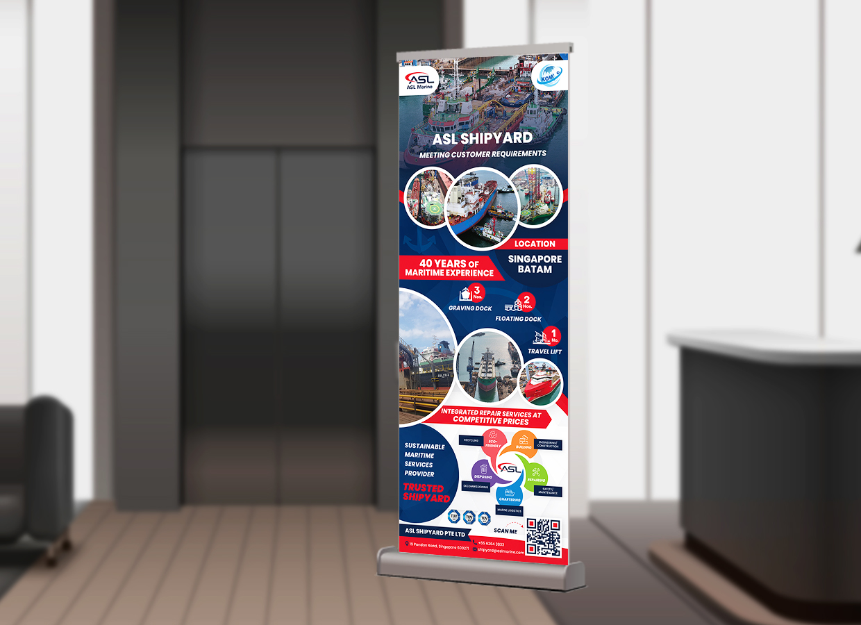
ASL SHIPYARD
followed by:
MEETING CUSTOMER REQUIREMENTS
This establishes both the company identity and the customer-focused positioning near the top of the display.
The message closely reflects the client’s own USP, which described the shipyard as striving to meet customer requirements.
Placing this message above the detailed service information ensures the viewer understands the business before moving into the supporting capabilities.
Using Real Shipyard Photography
The banner relies heavily on actual maritime and shipyard imagery.
The client specifically confirmed that a gallery of images had been provided for the design.
The finished artwork uses images showing:
- shipyard operations
- vessels in dock
- repair environments
- marine infrastructure
- shipyard facilities
This gives the standee greater authenticity than relying only on generic maritime stock photography.
For a technical industrial business, real operational imagery can be especially valuable because the facilities themselves are part of what the company is promoting.
Highlighting 40 Years of Maritime Experience
One of the strongest pieces of information in the finished standee is:
40 Years of Maritime Experience
This is given a prominent red panel rather than being hidden within supporting copy.
For a shipyard, longevity and operational experience can be highly relevant to prospective customers.
The banner therefore treats this as a major credibility message.
Its placement near the upper-middle section means it can be seen even before the viewer reaches the more detailed facility information.
Singapore and Batam Locations
The banner also prominently identifies:
Singapore
Batam
under the location section.
This supports the broader regional positioning of the shipyard.
The client’s questionnaire specifically referred to vessel owners trading within Southeast Asia, so displaying these locations helps reinforce that regional relevance.
The information is kept brief and visually prominent, which is appropriate for a display banner.
Presenting Graving Dock Capacity
The standee highlights:
3 Graving Docks
as one of the shipyard’s physical capabilities.
Rather than placing all infrastructure information into a paragraph, the design separates each facility into a distinct visual item.
This helps senior business viewers assess the shipyard’s capabilities quickly.
The use of a simple number-plus-label treatment makes the information much easier to scan from a distance.
Presenting Floating Dock Capacity
The banner also shows:
2 Floating Docks
as another facility capability.
This is positioned alongside the graving dock information and uses the same visual system.
Repeating the structure creates consistency.
It allows the viewer to compare different facilities without needing to interpret a dense specification table.
Highlighting the Travel Lift
A third visible facility item is:
1 Travel Lift
Together with the graving docks and floating docks, this provides a compact overview of the yard’s physical infrastructure.
This section works particularly well on a pull up banner because it turns technical facility information into quick visual proof points.
The reader can absorb:
3 + 2 + 1
before moving deeper into the design.
Integrated Repair Services
Another strong message on the artwork is:
Integrated Repair Services at Competitive Prices
This connects the physical yard facilities to the actual service proposition.
The banner therefore does not stop at saying what infrastructure exists.
It also explains what the shipyard offers customers through those facilities.
This supports the client’s positioning around reliability and reasonable pricing.
Communicating a Trusted Shipyard Position
Toward the lower portion, the banner includes:
TRUSTED SHIPYARD
This closely matches the tone requested in the questionnaire.
The client specifically used “trusted” as one of the central characteristics of the company.
Repeating that idea visually reinforces the intended brand perception without requiring a lengthy explanation.
Sustainable Maritime Services Positioning
The finished banner also presents ASL as a:
Sustainable Maritime Services Provider
This gives the lower section a broader corporate message beyond traditional repair capacity.
The surrounding service graphic introduces multiple maritime-related activities in a compact visual form.
Rather than listing every activity in long paragraphs, the diagram allows the standee to communicate a broader service ecosystem while keeping the page visually manageable.
Blue, White and Dark Red Colour Direction
The colour palette came directly from the client brief:
Blue, White and Dark Red.
The final artwork uses dark blue as the dominant corporate foundation.
White provides strong contrast for:
- headings
- facility information
- body text
- key messages
Red is used strategically for:
- section bands
- facility-number circles
- directional graphic elements
- emphasis areas
- the experience statement
- contact details
This creates a strong industrial and corporate appearance without introducing colours outside the requested brand direction.
Using Circular Photography to Organise Technical Content
The banner uses circular image frames repeatedly.
This helps separate different shipyard photographs while maintaining a consistent design language.
Without this structure, a tall banner containing multiple operational photographs could easily become visually cluttered.
The circles help:
- frame the imagery
- separate different facilities
- create movement down the banner
- connect the different sections visually
This makes the information easier to follow from top to bottom.
Building a Strong Vertical Information Flow
A pull up banner has very limited horizontal space.
The design therefore needs to guide the viewer vertically.
This project follows a logical sequence:
ASL Shipyard
?
Meeting Customer Requirements
?
Shipyard Photography
?
Maritime Experience
?
Locations
?
Dock & Lift Facilities
?
Repair Services
?
Sustainable Maritime Services
?
Trusted Shipyard
?
Contact Information & QR Code
This hierarchy allows the viewer to understand the company at several levels depending on how much time they spend with the banner.
Typography for Distance Readability
Important messages are set in bold uppercase typography.
These include:
ASL SHIPYARD
40 YEARS OF MARITIME EXPERIENCE
INTEGRATED REPAIR SERVICES AT COMPETITIVE PRICES
TRUSTED SHIPYARD
This is especially appropriate for a standee because major information needs to remain readable from a greater distance than a brochure or name card.
Smaller supporting information is reserved for viewers who move closer to the banner.
The typography therefore supports two viewing distances:
far viewing: key company messages
close viewing: detailed capabilities and contact information
Using a QR Code for Digital Follow-Up
The lower section includes a QR code accompanied by a SCAN ME prompt.
This provides a digital next step without requiring additional printed information.
For an exhibition or corporate event setting, a viewer may scan the code to access more detailed company information after seeing the standee.
This is particularly useful because a pull up banner should not attempt to carry the same amount of detail as a website or corporate brochure.
Contact Information at the Base
The contact information is positioned at the bottom of the banner.
This follows a sensible display hierarchy.
The upper section first attracts attention and establishes capability.
The lower section then provides the practical next step for viewers already interested in the business.
The questionnaire supplied the company’s Pandan Road address, telephone number, email and website for use within the design.
Designing for Exhibitions and Corporate Events
A standee like this can reasonably be used at:
- maritime exhibitions
- trade shows
- industry conferences
- corporate events
- customer meetings
- shipyard presentations
- reception areas
- business networking events
In these environments, the design needs to communicate the company quickly among many other visual displays.
Strong photography, concise proof points and clear branding become more important than lengthy explanatory copy.
The same principle of visual hierarchy is also discussed in our article on tips to make promotional designs stand out, where attention, contrast and structured information are important even though the final formats differ.
Maintaining Corporate Consistency
The questionnaire specifically asked the Subraa Team to refer to the company’s existing brochure.
That is important because exhibition and display materials should not look disconnected from the company’s broader identity.
The banner therefore works with:
- existing logos
- corporate colours
- maritime imagery
- established company messaging
rather than introducing a completely different visual system.
This helps maintain recognition when viewers encounter the company through multiple marketing materials.
Final Pull Up Banner Design Direction
The completed design brings together:
- ASL Shipyard branding
- customer-focused positioning
- actual shipyard photography
- 40 years of maritime experience
- Singapore and Batam locations
- 3 graving docks
- 2 floating docks
- 1 travel lift
- integrated repair services
- competitive-price messaging
- sustainable maritime services positioning
- trusted shipyard messaging
- blue, white and dark red branding
- contact information
- QR code
The result is a corporate standee that communicates both credibility and operational capability without requiring the viewer to read large amounts of copy.
The Subraa Team used a layered visual hierarchy so that major business strengths can be understood from a distance, while more detailed information remains available when the viewer approaches the banner.
Visitors can explore other display and corporate design projects through the Subraa portfolio.
Pull Up Banner Design for Maritime & Industrial Businesses in Singapore
Industrial and maritime companies often need display materials that communicate technical capability without becoming visually overwhelming.
The strongest information may include:
- years of experience
- facilities
- service capabilities
- geographical coverage
- operational imagery
- company positioning
For this project, the Subraa Team organised those elements into a tall-format corporate display suitable for a professional maritime audience.