
Name Card Design for a Swimming Instructor in Singapore
Category:
Published Date: Oct 01, 2026
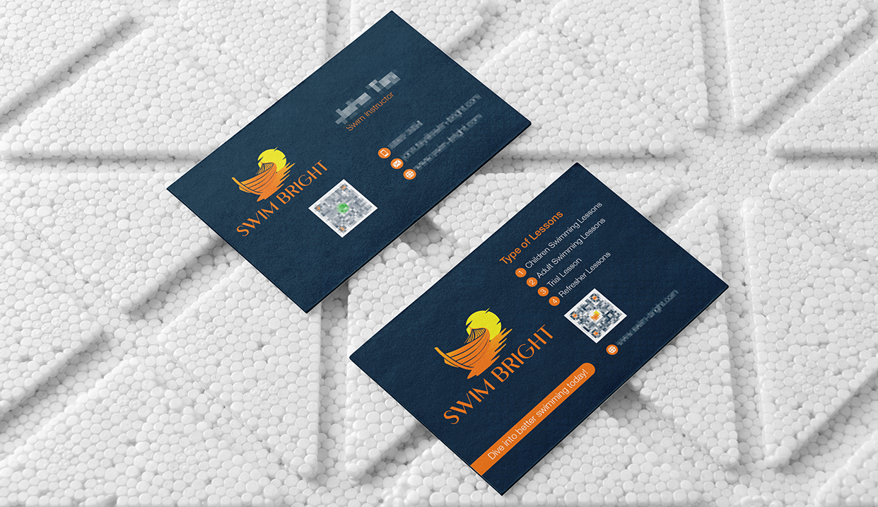
Swimming Instructor Name Card Design Singapore: Project Overview
This swimming instructor name card design Singapore project was developed for Swim Bright, a swim coaching service.
The card needed to perform more than a standard contact-information function.
It had to introduce the instructor, reinforce the Swim Bright brand, provide practical contact details and also communicate the different swimming lesson options available.
The client identified the instructor designation as:
Swim Instructor
and described the business as a Swim Coaching service.
The Subraa Team therefore approached the name card as both a personal contact card and a compact promotional piece for the coaching business.
Businesses requiring similar professional collateral can explore our name card design services in Singapore.
Understanding the Client's Name Card Brief
The client gave a very clear structure for both sides of the card.
For the front, the requested information included:
- name
- mobile number
- business name
- designation
- email address
- website address
For the back, the client wanted:
Dive into better swimming today!
followed by the lesson categories:
- Children Swimming Lessons
- Adult Swimming Lessons
- Refresher Lessons
- Trial Lesson
This gave the design a useful front-and-back distinction.
The front could focus on the instructor and contact details, while the reverse could promote the actual swim coaching services.
Creating a Minimal and Simple Name Card
The client specifically requested the card to be perceived as:
Minimal & Simple.
That requirement shaped the information hierarchy.
Rather than filling the card with decorative graphics, the design relies on:
- strong logo placement
- structured typography
- generous spacing
- limited colour use
- clean iconography
- clearly separated lesson information
This keeps the card functional even though it contains more information than a basic personal business card.
The design remains easy to scan without losing the promotional value of the reverse side.
Designing the Front for Instructor Recognition
The front of the card focuses on the swimming instructor and the Swim Bright identity.
The existing logo is given strong visual prominence.
The instructor’s name and designation appear separately from the contact information, helping the viewer understand who the card belongs to and what the person does.
The client also specifically requested relevant icons for:
- call
- website
Using these icons helps organise the details visually and reduces the need for additional labels.
This makes the contact section more compact while preserving readability.
Using the Existing Swim Bright Logo
The client already had a logo and specifically requested the Swim Bright V6 logo design to be incorporated into the name card.
That meant the card needed to support an existing brand identity rather than create a completely new visual direction.
The final layout therefore gives the logo enough prominence on both sides.
This maintains consistency and ensures the name card is clearly associated with the Swim Bright brand even when the instructor information is viewed separately.
For businesses still developing their identity before creating supporting collateral, the Subraa Team also provides Logo Design Singapore Services.
Presenting Swimming Lesson Types Clearly
The reverse side provides a compact overview of the lesson options.
These include:
Children Swimming Lessons
Adult Swimming Lessons
Refresher Lessons
Trial Lesson
Placing these on the reverse transforms the card into more than a contact item.
Someone receiving the card can immediately understand that Swim Bright offers coaching for different types of swimmers rather than only one age group or lesson format.
This is particularly useful for a service business where the card may be passed between parents, adult learners or potential students.
“Dive into Better Swimming Today!” Call to Action
The client specifically supplied the slogan:
Dive into better swimming today!
The finished card uses this as a visible call to action on the reverse.
The wording is relevant to the business because it combines a swimming reference with an invitation to take the next step.
Unlike a generic tagline, it serves both branding and promotional purposes.
It also helps give the reverse side a stronger ending rather than simply listing lesson categories.
Deep Blue as the Dominant Colour
The client specifically requested blue as the dominant colour.
The final artwork uses a deep blue background across both sides of the name card.
This gives the design a strong and consistent foundation.
Blue also visually connects naturally with swimming and water, although the more important point for this project is that it follows the client’s stated colour preference.
Orange accents from the existing identity are used selectively to highlight:
- logo elements
- icons
- lesson numbering
- the call-to-action strip
This creates contrast without competing with the dominant blue.
Typography Direction
The client indicated a preference for:
Sans Serif
and
Type Writer typography.
The finished card uses clear modern typography rather than ornate or highly decorative lettering.
This supports the requested minimal and simple direction.
The typography hierarchy also separates:
- instructor identity
- contact details
- lesson heading
- individual lesson types
- call to action
This allows several categories of information to coexist without appearing visually crowded.
Horizontal Name Card Layout
The client specifically preferred a horizontal business card.
This orientation works well for the amount of information required.
On the contact side, the horizontal space allows the logo and instructor details to coexist comfortably.
On the reverse, it creates enough width to list the lesson types while maintaining the logo, QR code and call to action.
The card therefore uses the available space functionally rather than forcing a large amount of information into a narrow vertical layout.
Using QR Codes as Digital Touchpoints
The finished design includes QR codes on both sides.
These create an additional digital connection from the physical name card.
For a swim coaching business, a recipient may want to:
- visit the website
- contact the instructor
- make an enquiry
- learn more about lessons
The QR code can support these actions without requiring additional printed instructions.
This is particularly useful on a compact name card where space is limited.
Balancing Personal and Business Branding
A swimming instructor’s name card needs to represent both:
the individual instructor
and
the business
If the card focuses only on the person, the Swim Bright brand may become secondary.
If it focuses only on the company, the recipient may struggle to identify who they should contact.
The design balances both.
The Swim Bright identity receives strong visual prominence, while the instructor’s name and designation remain clear.
This makes the card suitable for one-to-one introductions while still building recognition for the broader business.
Using the Reverse as a Mini Service Card
One of the stronger choices in this project is using the reverse side to explain the lesson offering.
Instead of simply repeating the logo or leaving the reverse largely decorative, it communicates actual services.
That gives the card additional practical value.
A recipient can immediately see whether Swim Bright provides a lesson that may be relevant to:
- their child
- themselves
- someone returning to swimming
- someone looking to try a lesson first
This approach is useful for service businesses because the name card becomes a small marketing tool as well as a contact card.
Your existing business card design guide is a natural supporting resource here because it discusses how branding, information hierarchy and practical contact information can be organised within a professional card.
Designing for Print
The client also specified Pantone as the preferred colour format for printing.
That requirement is relevant because the artwork is ultimately intended as a physical printed item.
Name card preparation may need to account for:
- card dimensions
- bleed
- safe area
- typography size
- colour consistency
- QR-code clarity
- print-ready file preparation
The visual layout therefore needs to remain effective not only on screen but also at actual name-card size.
Maintaining Clear Contact Information
The card includes several contact methods rather than relying on one channel.
The questionnaire supplied:
- mobile
- website
and specifically asked for call, WhatsApp, email and website icons to be incorporated.
The design groups these details together so they remain easy to find.
This is important because the practical purpose of the card is still to help prospective students or parents contact the instructor.
The promotional content should support that goal rather than overwhelm it.
Final Name Card Design Direction
The completed design brings together:
- Swim Bright branding
- instructor identity
- swim coaching positioning
- children’s swimming lessons
- adult swimming lessons
- refresher lessons
- trial lessons
- deep blue dominant colour
- orange supporting accents
- contact icons
- QR codes
- horizontal layout
- “Dive into better swimming today!” call to action
The result is a name card that performs both a professional and promotional role.
The front provides the instructor’s identity and contact information, while the reverse helps prospective customers understand the available coaching options.
Visitors looking for more examples of corporate and professional collateral can explore the Subraa portfolio.
Name Card Design for Coaches & Service Businesses in Singapore
Independent coaches and service professionals often need a name card to communicate more than just their name and telephone number.
It can also introduce:
- the business
- the service category
- available programmes
- website or digital channels
- a clear next step
For this project, the Subraa Team created a double-sided name card that combines instructor contact information with Swim Bright’s swimming lesson offering in a compact and professional format.