
Flyer Design for an eCommerce Fulfillment Company in Singapore
Category:
Published Date: Oct 01, 2026
eCommerce Fulfillment Flyer Design Singapore: Project Overview
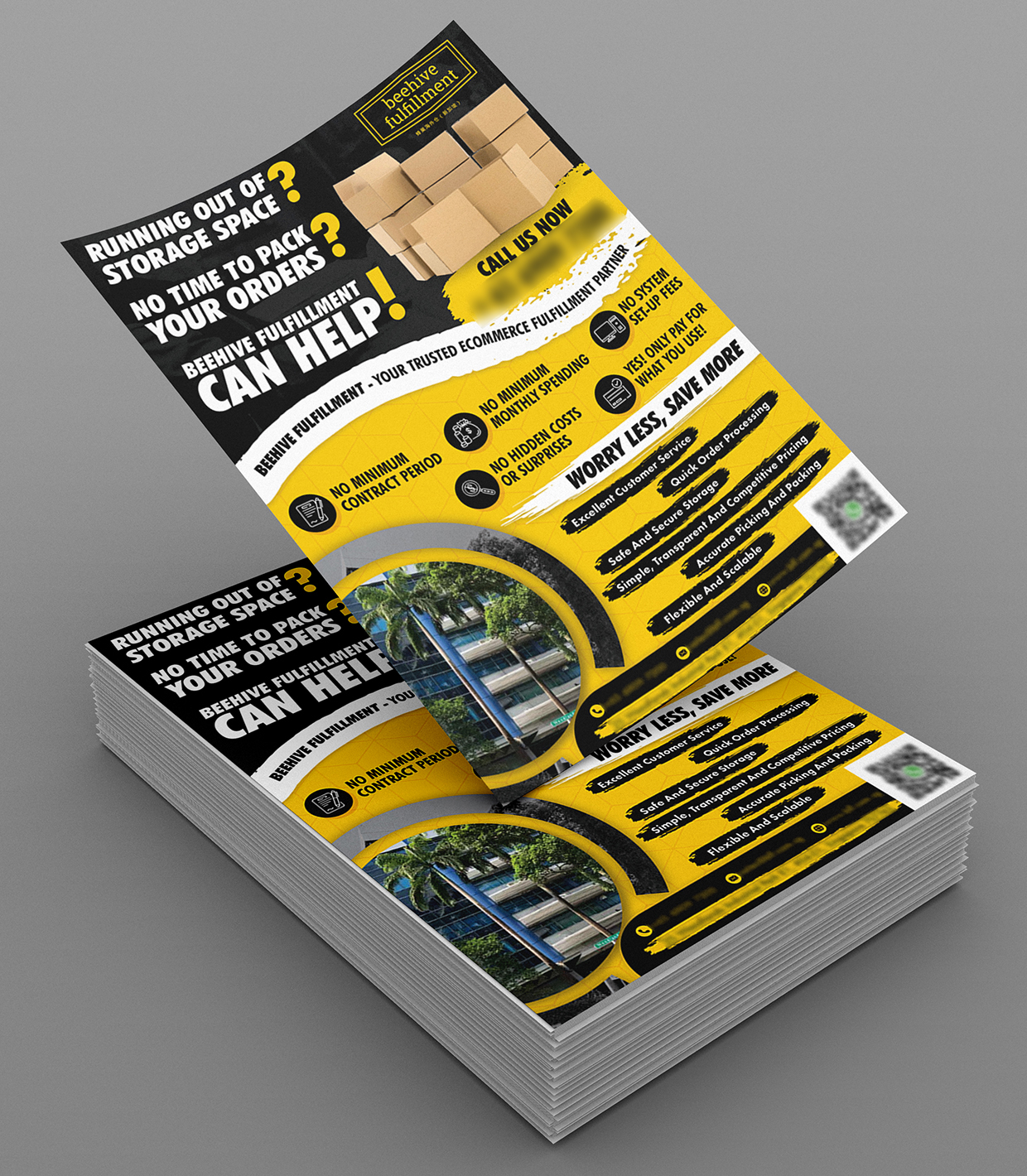
This eCommerce fulfillment flyer design Singapore project was developed for a company providing fulfilment support to online businesses.
The target audience was specifically identified as eCommerce business owners, mostly between 25 and 50 years old.
The flyer therefore needed to speak directly to common operational problems faced by growing online businesses.
The client supplied opening ideas such as:
Running out of storage space?
No time to pack your orders?
Beehive Fulfillment can help!
These questions gave the design a clear problem-and-solution structure.
Rather than beginning with a long company introduction, the flyer immediately addresses practical fulfilment challenges that an eCommerce business owner might recognise.
For businesses requiring similar promotional materials, the Subraa Team provides custom flyer design services in Singapore based on the business, target audience and campaign purpose.
Understanding the Client's Flyer Brief
The client already had an existing business logo but did not have an existing flyer design.
The requested flyer direction included:
- portrait orientation
- yellow as the main corporate colour
- a friendly and approachable tone
- responsive and reliable positioning
- cost-effective messaging
- focus on eCommerce business owners
- storage and fulfilment pain points
- order packing support
- transparent pricing
- fulfilment-related selling points
- use of the client’s warehouse building image
- suitable supporting stock imagery where required
The client also specifically mentioned that yellow text on white or transparent backgrounds had not printed well in previous experience, so that treatment was to be avoided.
That practical print consideration influenced how the strong yellow brand colour needed to be used.
Addressing eCommerce Fulfillment Pain Points
The flyer opens with two direct questions:
RUNNING OUT OF STORAGE SPACE?
NO TIME TO PACK YOUR ORDERS?
These are not generic promotional headlines.
They directly reflect the client’s supplied ideas and address common operational issues for eCommerce sellers.
This helps the flyer connect the service to a real business problem before presenting the company as the solution.
The large:
CAN HELP!
message then completes that problem-solution structure.
This is useful for a service-based flyer because the audience first recognises the pain point and then sees the provider’s role.
Positioning the Business as an eCommerce Fulfillment Partner
The client specifically provided the positioning line:
Beehive Fulfillment – Your Trusted Ecommerce Fulfillment Partner.
The flyer uses this idea prominently within the central content area.
That wording helps define the company more clearly than a generic warehousing message would.
The service is not presented merely as storage space.
Instead, the company is positioned as a broader fulfilment partner that can support order processing, packing, storage and related operational needs.
That distinction is important for the intended eCommerce audience.
Highlighting No Minimum Contract Period
One of the key selling points shown in both the supplied website reference and finished flyer is:
No Minimum Contract Period
This message reduces the perception of long-term commitment.
For smaller or growing eCommerce businesses, flexibility can be particularly relevant because order volume and storage needs may change over time.
The flyer therefore gives this benefit its own icon and headline rather than burying it within supporting text.
No Minimum Monthly Spending
Another visible selling point is:
No Minimum Monthly Spending
This reinforces the flexible positioning of the service.
For an eCommerce business owner comparing fulfilment providers, minimum monthly commitments can be an important consideration.
Giving this information its own visual treatment allows viewers to identify the pricing model quickly.
No Hidden Costs or Surprises
The flyer also highlights:
No Hidden Costs or Surprises
This supports the client’s requested tone of being:
friendly, responsive, reliable and cost effective.
Pricing transparency can be an important differentiator in fulfilment services because customers may be concerned about additional handling, storage or processing charges.
The message therefore works well alongside the broader:
Only Pay for What You Use
positioning supplied in the client’s website reference.
Only Pay for What You Use
The client’s reference material clearly emphasised:
Only Pay for What You Use.
The finished flyer incorporates that concept within the benefits section.
This is one of the strongest commercial messages in the design because it communicates the pricing philosophy in a short, understandable way.
Instead of explaining the entire billing model, the flyer gives readers a simple takeaway:
they pay according to actual usage rather than being tied to unnecessary fixed commitments.
Excellent Customer Service
The flyer also presents:
Excellent Customer Service
as one of the service strengths.
In the website material supplied with the questionnaire, the client explained that every customer would be assigned a dedicated account manager to maintain a single point of contact.
Even though the flyer reduces the amount of supporting text, the headline itself communicates the intended service standard.
This is a good example of simplifying website content for print rather than attempting to reproduce every sentence.
Quick Order Processing
Another key service benefit is:
Quick Order Processing
This directly addresses an operational priority for eCommerce businesses.
Customers ordering online expect products to move through fulfilment efficiently.
The flyer therefore gives order processing dedicated prominence within the service-benefit section.
This supports the overall message that Beehive Fulfillment is not simply storing goods but actively helping businesses process and dispatch orders.
Safe and Secure Storage
Storage remains a central part of the offering.
The flyer highlights:
Safe and Secure Storage
and supports it visually with warehouse-related imagery.
The questionnaire’s supplied website content also referenced warehouse security and keeping inventory safe.
The final design keeps the message concise while still reinforcing an important requirement for businesses entrusting inventory to a fulfilment partner.
Simple, Transparent and Competitive Pricing
Another visible service point is:
Simple, Transparent and Competitive Pricing
This aligns particularly well with the client’s requested brand tone of being cost effective.
Rather than using vague wording such as “great value,” the flyer communicates the pricing proposition more specifically:
- simple
- transparent
- competitive
These terms reinforce the earlier “no hidden costs” and “only pay for what you use” messages.
Accurate Picking and Packing
The flyer also identifies:
Accurate Picking and Packing
as part of the fulfilment service.
This is a particularly relevant message for eCommerce businesses because fulfilment quality depends not only on speed but also on accuracy.
Incorrect picking or packing can affect customer satisfaction and operational costs.
Giving this benefit its own line helps communicate that the service covers both the physical storage of inventory and the fulfilment process itself.
Flexible and Scalable Fulfillment
The final benefits section includes:
Flexible and Scalable
This is relevant to businesses whose order volume may change over time.
eCommerce companies may experience:
- seasonal demand
- promotional spikes
- growth periods
- changing inventory volumes
A scalable fulfilment arrangement can therefore be an important consideration.
The flyer presents this message clearly without needing to explain every possible use case.
Black and Yellow Visual Direction
Yellow was specifically identified as the company’s corporate colour.
The finished flyer uses yellow extensively across:
- background sections
- icons
- call-to-action areas
- accent shapes
- headings
- graphic dividers
Black provides strong contrast.
This is especially important because the client had previously experienced printing problems when yellow text was placed against white or transparent backgrounds.
The darker backgrounds therefore help the yellow remain visible and bold rather than weak or washed out.
Bold Typography for Immediate Attention
The upper headline uses heavy uppercase typography.
This suits the purpose of the flyer because the opening questions need to be understood quickly.
The hierarchy makes:
RUNNING OUT OF STORAGE SPACE?
and
NO TIME TO PACK YOUR ORDERS?
visually dominant.
The phrase:
CAN HELP!
receives even stronger prominence.
This creates a quick reading sequence that works well for promotional material aimed at busy business owners.
Using Warehouse and Box Imagery
The design incorporates imagery of stacked boxes and the client’s warehouse building.
The client specifically supplied a warehouse-building photograph and allowed suitable free images to be used where they supported the flyer.
The box imagery immediately connects with:
- storage
- packing
- fulfilment
- inventory
while the warehouse image gives the flyer a real-business context.
This combination is more useful than relying entirely on abstract eCommerce graphics.
Creating a Strong B2B Flyer Hierarchy
The flyer follows a clear progression:
business problem
?
Beehive can help
?
eCommerce fulfilment positioning
?
pricing and contract benefits
?
service strengths
?
warehouse context
?
contact / QR action
This gives the viewer a logical path through the information.
The design does not expect the reader to understand every detail simultaneously.
Instead, it moves from pain point to solution and then into reasons to consider the service.
Our existing article on tips to make your flyer design stand out is relevant here because hierarchy and immediate visual communication are particularly important for business-focused promotional material.
Keeping the Flyer Informative Without Becoming Too Wordy
The client explicitly said that small website text could be omitted if the flyer became too wordy.
That is an important design instruction.
Website content and flyer content serve different purposes.
A website can accommodate detailed explanations.
A flyer normally needs to communicate the strongest points quickly.
The Subraa Team therefore reduced the information into short benefit statements rather than reproducing all of the website copy.
This keeps the flyer more scannable while retaining the key value propositions.
Using a QR Code for the Next Step
The flyer includes a QR code near the lower-right area.
This creates a direct transition from printed material to digital action.
For an eCommerce fulfilment business, potential customers may want to:
- visit the website
- review services
- request a quotation
- enquire about storage
- ask about fulfilment requirements
The QR code provides a convenient next step without requiring the flyer to contain all possible information.
Designing for eCommerce Business Owners
The client identified the intended audience as eCommerce business owners, mostly between 25 and 50 years old.
This is a business audience likely to value practical benefits.
The flyer therefore concentrates on:
- saving time
- storage capacity
- pricing transparency
- fulfilment flexibility
- quick processing
- picking and packing
- scalable support
rather than decorative brand messaging alone.
The design remains visually bold, but the information itself stays operational and business-oriented.
Why a Flyer Works for Fulfillment Services
For B2B services such as fulfilment, a flyer can work as a compact introduction to the company.
It can potentially be distributed during:
- business networking
- eCommerce events
- trade shows
- sales meetings
- warehouse visits
- direct outreach
The flyer gives potential customers a quick overview of the main problems addressed by the service and the reasons to make an enquiry.
Your existing article on reasons to use flyers to promote your business is a useful supporting link here because this project uses the flyer as a concise awareness and lead-generation tool.
Final Flyer Design Direction
The completed design brings together:
- eCommerce fulfilment positioning
- storage-related pain points
- packing and order-processing messaging
- no minimum contract period
- no minimum monthly spending
- no hidden costs
- pay-for-what-you-use positioning
- customer service
- quick order processing
- secure storage
- transparent pricing
- accurate picking and packing
- flexible and scalable fulfilment
- yellow corporate branding
- warehouse imagery
- QR-based call to action
The result is a business-focused flyer that communicates both the operational problems being solved and the main commercial benefits of the fulfilment service.
Rather than reproducing detailed website copy, the flyer turns the key information into a fast, visual presentation aimed specifically at eCommerce business owners.
Visitors can explore more work created by the Subraa Team through the Subraa portfolio.
Flyer Design for eCommerce & Logistics Businesses in Singapore
eCommerce and logistics businesses often provide services that are operationally complex.
A promotional flyer therefore needs to simplify the value proposition without oversimplifying the business.
For this project, the Subraa Team structured the information around the customer’s likely pain points first, followed by practical service advantages such as storage, order processing, pricing transparency and fulfilment flexibility.