
Flyer Design for a Home Nursing Agency in Singapore
Category:
Published Date: Sep 29, 2026
Home Nursing Flyer Design Singapore: Project Overview
This home nursing flyer design Singapore project was developed for a healthcare business providing home nursing and related support services.
The client described the company’s positioning as:
Premium + Professional + Empathetic Home Nursing Services
and highlighted that the team includes NUS- and NTU-trained nurses and gerontologists.
That positioning shaped the overall direction of the flyer.
The design needed to communicate care and empathy without becoming overly soft or informal. At the same time, it had to maintain enough structure and professionalism to appeal to family members and older adults evaluating home care options.
The Subraa Team therefore approached the flyer as a healthcare communication piece rather than a generic promotional leaflet.
Businesses requiring similar marketing materials can explore our flyer design services in Singapore for custom layouts developed around each business’s content, audience and promotional objective.
Understanding the Client's Flyer Brief
The client provided several clear requirements before the design work began.
The flyer needed to:
- use the existing logo previously designed by the Subraa Team
- reflect a serious, premium and empathetic tone
- target an audience aged over 40
- particularly appeal to people above 60
- use colours aligned with the logo
- use a portrait orientation
- draw suitable key points from existing website content
- use free stock imagery where appropriate
These details gave the Subraa Team a clear framework for the design direction.
Designing for an Older Healthcare Audience
The client’s target audience was described as:
above 40, particularly individuals above 60.
That makes readability especially important.
A healthcare flyer aimed at an older audience should avoid overly small text, dense decorative elements or unnecessarily complicated information structures.
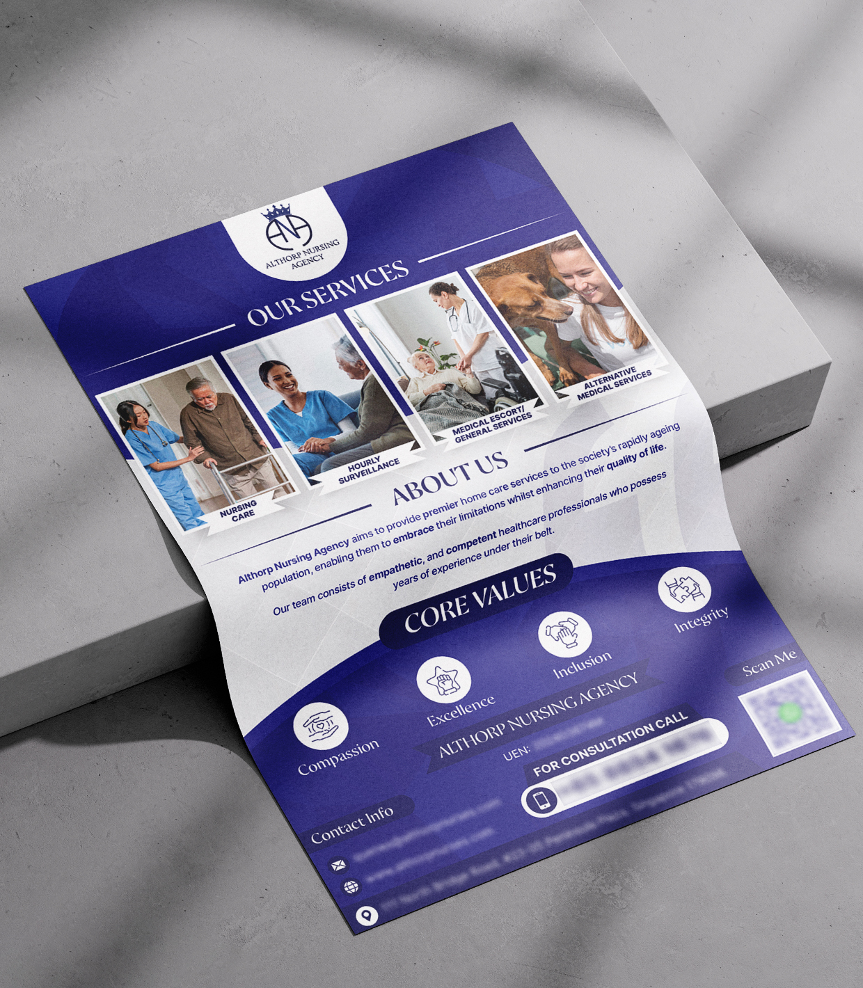
The design therefore uses a clear visual hierarchy, separated service blocks and strong headings.
The main service areas are presented visually using supporting healthcare photographs, helping readers understand the offering without needing to process long paragraphs.
This approach makes the flyer easier to scan while still maintaining a professional presentation.
Presenting Home Nursing Services Clearly
The flyer visually separates the company’s key services into individual panels.
These include:
- nursing care
- hourly surveillance
- medical escort and general services
- alternative medical services
Each service is supported by a relevant image.
This helps communicate the range of care options in a compact format.
Rather than grouping everything into one large text section, the service blocks make the flyer easier to understand and more approachable for readers who may be reviewing several healthcare options at once.
Communicating Premium and Professional Care
The client specifically wanted the tone to feel:
Serious + Premium + Empathetic.
The design reflects this through a restrained visual structure.
The layout avoids bright promotional styling or playful elements.
Instead, it uses a more formal composition with clean spacing, professional healthcare imagery and a consistent purple-and-white palette.
This helps the flyer feel appropriate for a service where trust, care quality and credibility are important.
Using Empathetic Healthcare Imagery
The client did not supply its own images and was comfortable with suitable free stock imagery.
The flyer therefore uses healthcare and caregiving visuals to communicate the nature of the service.
The imagery shows situations associated with:
- nursing support
- elderly care
- home care
- medical assistance
- companionship
Using human-focused imagery is especially important for this type of business.
Home nursing is a highly personal service, so photographs showing interaction between care professionals and patients can communicate empathy more effectively than abstract healthcare graphics alone.
Purple and White Colour Direction
The client did not specify a new colour palette, but requested that the flyer align with the colours used in the logo.
The finished design therefore uses purple as the dominant brand colour, supported by white and lighter neutral areas.
Purple provides a strong visual identity without making the flyer feel aggressive.
White space helps balance the darker colour areas and supports readability.
This gives the flyer a clean healthcare presentation while keeping the design closely connected to the existing brand identity.
Structuring the About Us Section
The flyer includes an About Us section beneath the service area.
This gives readers additional context about the company after they have first seen the service categories.
The layout places this information below the visual service overview, which is a sensible reading order:
What services are offered?
then
Who is providing them?
This sequence helps the flyer introduce the practical offering before moving into company positioning and background.
Highlighting Core Values
The flyer also gives dedicated space to the company’s core values.
The visible values include:
- Compassion
- Excellence
- Inclusion
- Integrity
These are supported by simple iconography and presented within a distinct lower section of the design.
For a nursing and care business, values are not merely decorative content.
They help communicate the principles the organisation wants associated with its service.
Giving these values visual prominence reinforces the client’s requested empathetic and quality-focused positioning.
Designing a Clear Consultation Call to Action
The lower part of the flyer includes practical next-step information.
A consultation call section, contact details and QR code help move the reader from awareness to action.
This is important because a flyer should not only explain the service.
It should also make it easy for someone to take the next step.
For a home nursing agency, the likely next action may be to:
- call for consultation
- scan the QR code
- contact the agency directly
- enquire about care options
The design groups these elements toward the bottom, where they naturally follow the service and company information.
Portrait Layout for Healthcare Information
The client specifically preferred a portrait orientation.
That format works well for this project because it allows the content to flow from:
branding ? services ? about the agency ? values ? contact information
within one continuous vertical composition.
The portrait layout also makes the flyer suitable for printed distribution, display stands and digital sharing.
Typography and Readability
The flyer uses a combination of larger serif-style headings and smaller supporting text.
Key headings such as:
OUR SERVICES
ABOUT US
CORE VALUES
create strong visual breaks between sections.
This prevents the design from becoming one continuous block of content.
For an older audience, this kind of clear sectioning is especially useful because it reduces the effort required to understand the structure of the flyer.
Businesses planning promotional materials can also read our article on tips to make your flyer design stand out, which discusses hierarchy, layout and visual presentation.
Balancing Healthcare Information and Visual Appeal
Healthcare flyers often need to present a substantial amount of information while still feeling approachable.
Too much text can make the flyer look clinical or difficult to read.
Too little information can make the service offering unclear.
This project balances both by using:
- service photography
- short service labels
- concise company information
- value icons
- contact details
- a QR code
This allows the flyer to remain informative without feeling overly dense.
Building Trust Through Consistent Branding
The client asked the flyer to use the logo previously designed by the Subraa Team.
Using an existing logo and aligned colour palette helps maintain consistency across the business’s communication materials.
The same identity can potentially extend across:
- website
- brochures
- flyers
- name cards
- social media
- service documents
- presentation materials
Consistent branding is especially valuable for healthcare-related businesses, where familiarity and trust can influence how professional the organisation appears.
Final Flyer Design Direction
The completed flyer brings together:
- premium home nursing positioning
- professional healthcare imagery
- service-specific visual blocks
- portrait orientation
- purple and white branding
- clear company information
- core values
- structured consultation details
- QR code and contact information
- readable information hierarchy
The result is a professional healthcare flyer that communicates the agency’s services while supporting the client’s desired tone of seriousness, quality and empathy.
Visitors looking for more examples can explore the broader Subraa portfolio to view flyer, brochure, logo, name card and other design projects.
Flyer Design for Healthcare Businesses in Singapore
Healthcare businesses need promotional materials that communicate services clearly while maintaining trust and sensitivity.
A nursing agency, clinic, therapy provider or medical service company may require a very different design approach from a retail promotion or event flyer.
The content, audience, tone and visual hierarchy should therefore guide the design.
For this project, the Subraa Team created a healthcare flyer that balances professional service information with empathetic imagery and a clean, structured presentation.