
STEM Education Flyer Design for a Learning Centre in Singapore
Category:
Published Date: Sep 28, 2026
STEM Education Flyer Design Singapore: Project Overview
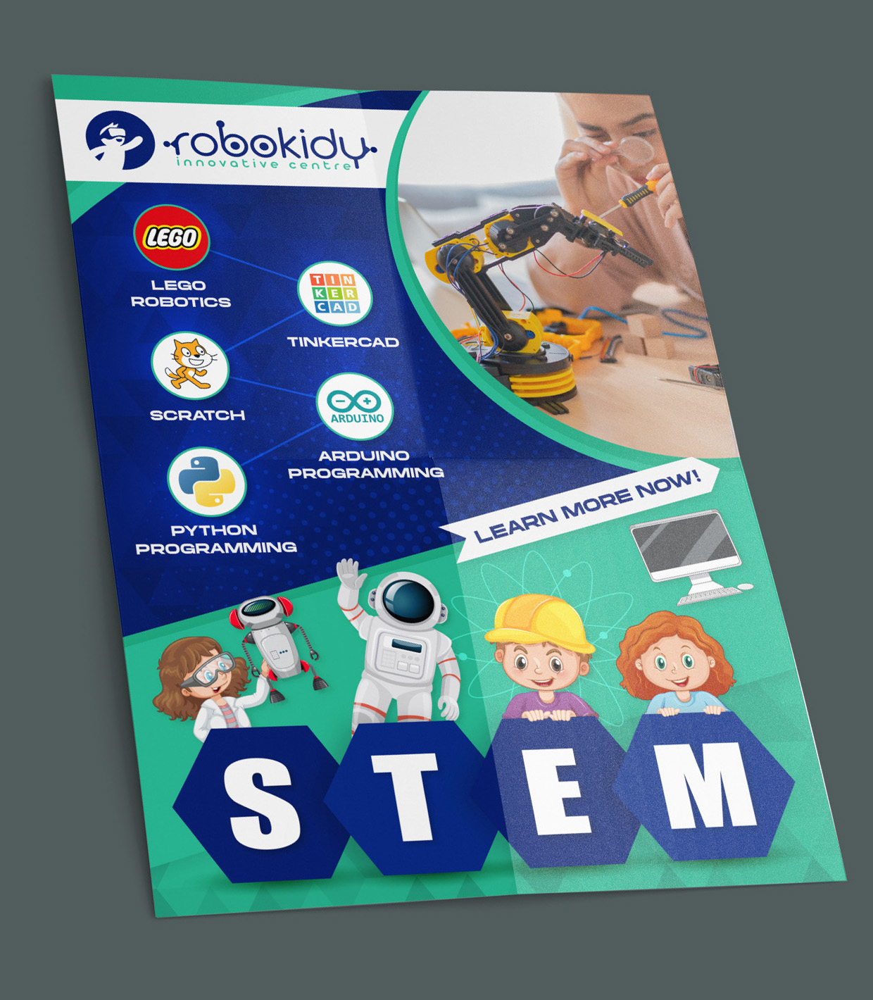
This STEM education flyer design Singapore project was created around technology-focused learning for children, bringing together robotics, coding and programming topics within a single promotional layout.
Educational flyers have a slightly different design challenge from conventional promotional flyers. They need to attract attention while also presenting enough information for parents and students to quickly understand what is being offered.
In this project, the flyer prominently communicates a STEM learning direction through references to robotics, coding platforms and programming languages.
The visible programmes include LEGO Robotics, Tinkercad, Scratch, Arduino Programming and Python Programming, giving the flyer a clear technology and hands-on learning focus.
Rather than relying heavily on paragraphs of text, the design uses recognisable icons, illustrations and visual hierarchy to communicate the subject matter quickly.
For businesses and organisations looking to communicate their services through printed marketing materials, the Subraa Team also provides flyer design services in Singapore tailored around the information, audience and purpose of each project.
Designing a Flyer for STEM Education
STEM education covers several different disciplines, and presenting multiple learning areas on one flyer can easily become visually crowded.
The challenge is to give each programme enough prominence without making the layout difficult to scan.
In this design, the various learning areas are grouped clearly on the left side of the composition. Each programme is represented by its own recognisable visual element together with supporting text.
This creates a simple visual path for the viewer:
programme icon ? programme name ? supporting STEM imagery
The structure makes it easier for parents or students to identify the available learning topics without needing to read a large block of copy.
Highlighting Robotics and Programming Programmes
The flyer places strong emphasis on practical technology education.
The visible learning areas include:
- LEGO Robotics
- Tinkercad
- Scratch
- Arduino Programming
- Python Programming
These subjects cover different stages and approaches to technology learning, from visual programming and creative digital tools to electronics and coding.
The flyer therefore needed a visual style broad enough to represent several STEM subjects without favouring only one programme.
A robotics-related photograph occupies a large portion of the upper-right area, immediately reinforcing the hands-on engineering and technology theme.
The image of a student working with a robotic arm gives the design a practical learning context rather than presenting STEM education only through abstract symbols.
Creating a Child-Friendly Visual Direction
Because the subject matter relates to children's education, the visual design needed to feel approachable rather than overly technical.
The lower portion of the flyer uses illustrated children, robots and educational imagery to soften the technical nature of programming and robotics.
This balance is important.
If the design relied entirely on circuit boards, code interfaces or technical diagrams, the flyer could feel too advanced or intimidating for younger learners.
On the other hand, making the flyer overly playful could weaken the educational and technology positioning.
The final visual direction balances both sides by combining:
- real technology imagery
- recognisable coding and robotics references
- bright illustrated characters
- structured programme information
- bold STEM lettering
This helps communicate that the learning environment is both educational and engaging.
Businesses planning printed promotional material can also refer to our guide on tips to make your flyer design stand out for broader considerations around hierarchy, readability and visual impact.
Strong STEM Visual Hierarchy
The word STEM forms one of the strongest visual elements in the flyer.
Each letter is positioned within a large geometric shape, creating a clear visual anchor near the bottom of the design.
This works especially well for an educational flyer because viewers can understand the overall subject almost immediately, even before reading the smaller programme descriptions.
The STEM lettering also creates a natural endpoint for the layout.
The eye begins with the brand and technology programmes in the upper section, moves through the robotics photograph and supporting content, and finishes at the large STEM treatment near the bottom.
This creates a more intentional visual journey than simply placing all of the information into equal-sized boxes.
Blue and Green Colour Direction
The design uses a strong combination of dark blue, turquoise and green.
Dark blue occupies much of the central information area and gives the flyer a technology-oriented visual foundation.
The brighter green and turquoise areas help prevent the overall design from becoming too dark and introduce a more energetic, youthful character.
These colours also provide useful separation between different sections of the flyer.
The blue area carries much of the programme information, while the lighter green section supports the illustrated STEM theme and call-to-action area.
White text and lighter graphic elements provide contrast against the darker sections, helping programme names remain readable.
Using Recognisable Technology Icons
One of the most important design choices is the use of recognisable programme and technology visuals.
Instead of describing each programme through long sentences, the flyer uses familiar symbols and logos alongside short labels.
This makes the information easier to scan.
A parent who is already familiar with Scratch, Python or LEGO Robotics can identify the relevant programme quickly.
For viewers who are unfamiliar with the individual platforms, the overall collection of robotics, programming and educational imagery still communicates the broader STEM theme.
Using visual recognition in this way is particularly useful for flyers because audiences often view printed promotional materials only briefly before deciding whether to read further.
Balancing Photography and Illustration
The flyer combines two very different visual styles:
photography and illustration.
The upper-right image provides realism and demonstrates a practical robotics activity.
The illustrated children, robot and STEM characters toward the bottom introduce a more playful and accessible learning atmosphere.
Combining both styles helps the flyer communicate to two audiences simultaneously:
- parents, who may be looking for structured educational value
- children, who may respond more strongly to colourful characters and engaging imagery
The key is maintaining a consistent overall composition so that the two visual styles do not feel disconnected.
The curved shapes and shared colour palette help bring the different elements together.
Typography and Readability
The flyer uses bold, uppercase typography for programme names and major calls to action.
This works well for a promotional piece because the key information needs to remain visible even when the flyer is viewed from a short distance.
Programme labels such as:
LEGO ROBOTICS
TINKERCAD
SCRATCH
ARDUINO PROGRAMMING
PYTHON PROGRAMMING
are kept relatively short and direct.
This gives each programme a clear visual identity without requiring additional explanatory copy within the main design.
The LEARN MORE NOW! call to action is also separated visually from the main information area, helping it function as a distinct next step.
Designing for Parents and Young Learners
Educational marketing materials often need to communicate with more than one audience.
Children may respond to colour, characters, robotics and playful imagery, while parents are more likely to look for clarity, programme relevance and educational value.
The flyer therefore combines visual excitement with structured content.
The technology programmes are presented clearly enough for adults to understand, while the surrounding imagery keeps the overall design engaging for younger learners.
This dual-audience consideration is particularly important for education-related flyers.
A design that appeals only to children may not provide enough confidence or information for parents, while a design aimed entirely at adults can feel too formal for a children's learning programme.
Flyer Design as a Promotional Tool for Education Businesses
Flyers can still be useful for education centres, enrichment providers, tuition centres and training organisations because they allow several programmes to be presented within one compact marketing piece.
They can be distributed physically, displayed at events, used at reception areas or adapted for digital sharing.
For education businesses in particular, a well-structured flyer can help communicate:
- available programmes
- learning areas
- age-appropriate activities
- key differentiators
- calls to action
The design should therefore support both information delivery and visual engagement.
The Subraa Team approaches each flyer project around the content and intended purpose rather than applying the same fixed layout to every business.
You can view more examples of our work through the broader Subraa design portfolio, which includes flyer design and other marketing collateral created across different industries.
Final Flyer Design Direction
The completed flyer brings together several elements:
- STEM education positioning
- robotics and programming programme references
- child-friendly illustrations
- practical robotics photography
- blue and green technology-inspired colours
- clear programme labels
- prominent STEM typography
- a visible call to action
The overall layout gives the flyer a clear educational and technology-focused identity while keeping the design energetic and accessible.
Rather than presenting the programmes as a simple list, the flyer turns the different learning topics into a visual experience that reflects robotics, coding and creative STEM learning.
Flyer Design for Education Businesses in Singapore
Education businesses often need promotional materials that can explain their programmes while still capturing attention.
A flyer for a STEM learning centre, tuition provider, enrichment programme or training organisation therefore needs more than attractive graphics. The layout should establish a clear hierarchy so that viewers can quickly understand the main offering and identify the information most relevant to them.
The Subraa Team creates custom flyer designs for Singapore businesses and organisations based on the supplied content, audience, branding and intended marketing purpose.