
Logo Design for a Luxury Cat Boarding Business in Singapore
Category:
Published Date: Oct 01, 2026
Luxury Cat Boarding Logo Design Singapore: Project Overview
This luxury cat boarding logo design Singapore project was developed for a business offering boutique accommodation designed exclusively for feline guests.
Kitnap was positioned around providing a refined and comfortable boarding experience for cats, with a strong emphasis on safety, serenity, enrichment and premium care. The business was also intended for discerning, high-end cat owners looking for a more considered boarding experience for their pets.
This meant the identity needed to feel very different from a typical pet shop or general pet-service logo.
The client wanted the brand to retain warmth, wit and personality while still presenting Kitnap as a premium boutique business.
The Subraa Team therefore approached the identity through simplicity, typography and a subtle feline reference rather than conventional pet imagery.
Businesses looking for similarly customised identities can explore our logo design services in Singapore.
Understanding the Client's Logo Brief
The client provided a particularly clear creative direction.
The required brand name was:
Kitnap
The client wanted the identity to feel:
- whimsical
- fun
- witty
- simple
- clean
- premium
- subtly connected to cats
At the same time, there was a very clear list of visual clichés to avoid.
The client specifically did not want:
- paws
- paw prints
- “meow”
- cat silhouettes
- anything too obviously pet-related
This made the project especially interesting because the logo still needed to suggest a feline business without using the most obvious cat-related imagery.
Designing a Cat Brand Without a Cat Silhouette
Pet-related identities often depend heavily on literal imagery.
For a cat business, common solutions might include:
- cat heads
- whiskers
- ears
- tails
- paws
- complete cat silhouettes
Those options would have made the industry immediately obvious, but they would also have gone directly against the client's brief.
The visual solution therefore needed to communicate the feline connection more indirectly.
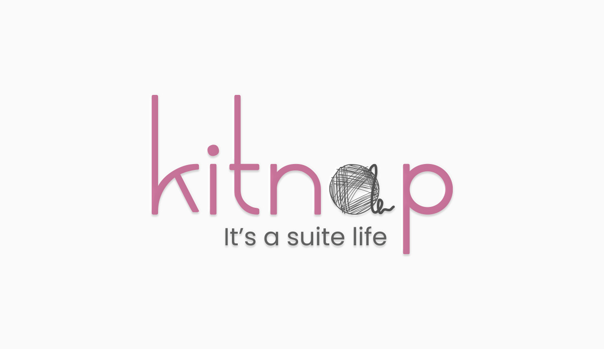
The finished identity uses a ball of yarn as the playful reference.
A yarn ball is strongly associated with feline play, yet it avoids illustrating the cat itself.
That allows the logo to retain the witty connection requested by the client while keeping the overall identity clean and understated.
Integrating the Yarn Ball into the Wordmark
The yarn illustration forms part of the actual Kitnap wordmark rather than appearing as a separate icon.
This is important because it keeps the identity visually compact.
The wordmark remains the main brand, while the yarn introduces personality at one focal point.
The hand-drawn texture of the yarn contrasts with the cleaner letterforms around it.
This produces a deliberate balance:
clean typography communicates refinement,
while the
yarn-ball detail introduces warmth and playfulness.
The concept therefore does not need several different feline references to communicate the personality of the business.
Creating a Premium but Playful Identity
The client described Kitnap as a luxury boutique accommodation aimed at discerning, high-end clients seeking excellent care for their cats. The accommodation itself was intended to provide a safe, serene and enriching environment with a high level of comfort.
The logo therefore had to balance two qualities that could easily conflict:
luxury and refinement
with
fun and feline personality
Making the logo too playful could cause the brand to feel more like a general pet shop.
Making it too formal could remove the warmth expected from a cat-focused hospitality business.
The final direction keeps most of the identity restrained and allows the yarn element to provide the playful accent.
That gives the brand character without overwhelming the premium positioning.
A Minimalist Approach to the Logo
The client specifically described their preferred logo direction as:
Simple, witty, clean.
The completed logo reflects this through a deliberately limited number of elements:
- Kitnap wordmark
- yarn-ball motif
- mauve pink
- dark grey
- supporting tagline
- generous negative space
There is no enclosing badge, decorative border, illustrated cat or complicated supporting graphic.
This makes the identity a good example of how a minimalist approach can still communicate a distinctive idea.
Your existing article on the minimalist approach in logo design is particularly relevant here because the project demonstrates how reducing visual elements can actually strengthen the main concept.
Mauve Pink, Grey and Dark Grey Colour Direction
The client provided a specific colour preference:
Mauve pink, grey and dark grey.
They also explicitly wanted to avoid colours that were too bright or loud because those would not represent the premium positioning they were seeking.
The completed identity follows that direction closely.
Mauve pink forms the main wordmark.
Dark grey provides contrast for the yarn detail and supporting typography.
The neutral white background allows both colours to remain prominent without introducing additional visual noise.
The palette feels softer and more refined than a brighter pet-store colour scheme, helping the identity support the boutique positioning.
Modern Light Typography
Typography was another area where the client gave unusually specific guidance.
They requested:
Modern, light font
and referenced Braga Huis Regular in their own visual concept.
The final wordmark follows that broad typographic character.
Its tall, lightweight letterforms create an elegant and contemporary appearance.
A heavier or more condensed typeface would have given the business a stronger, more assertive visual personality.
Instead, the light typography helps communicate a softer boutique experience.
Typography can strongly influence how a business identity is perceived, which is why our article on choosing the right font for a logo design is especially relevant to this particular project.
Avoiding Conventional Pet Branding
One of the strongest parts of the client brief was not simply what they wanted but what they wanted to avoid.
The client did not want the business to be represented through the most familiar pet-brand visual shorthand.
That decision helps make the final identity more individual.
A paw print would immediately communicate “pet”.
A cat silhouette would immediately communicate “cat”.
But those elements would say very little about the particular personality of Kitnap.
The yarn motif provides a more playful and indirect association while leaving the wordmark itself to establish the brand.
The “It's a Suite Life” Tagline
The client originally considered:
Eat . play . love
but was not certain whether it should ultimately be used.
The finished artwork instead carries:
It's a suite life
This final tagline connects much more directly with the boutique accommodation concept.
The word suite introduces a hospitality reference, while the phrase still retains the light, witty tone intended for the brand.
It also complements the logo rather than competing with it.
The tagline appears in smaller grey typography below the main identity, allowing Kitnap to remain the primary brand element.
Communicating Boutique Cat Accommodation
Kitnap is not positioned simply as a place where cats are temporarily kept.
The questionnaire describes the business around ideas such as:
- luxury
- boutique accommodation
- comfort
- serenity
- enrichment
- exceptional service
- stress-free customer experience
That distinction matters to the logo.
The identity needed to support the idea of a carefully considered hospitality experience exclusively for feline guests.
This is one reason an overly cartoonish or literal cat logo would have been less appropriate.
The restrained wordmark helps the brand sit closer to boutique lifestyle and hospitality branding while the yarn detail retains the feline connection.
Designing for High-End Cat Owners
The client specifically identified the intended customers as discerning, high-end clients looking for excellent care for their pet cats.
That target audience influenced the need for restraint.
Premium customers may expect the visual identity of a boutique accommodation business to feel considered and cohesive.
Using fewer colours, light typography and subtle imagery gives the identity a calmer visual character.
The design does not need to announce “luxury” through ornate graphics.
Instead, the premium quality is communicated through simplicity and control.
Negative Space as Part of the Identity
The generous white space surrounding the logo is important to the overall presentation.
Because the main wordmark is relatively light, allowing enough open space helps preserve its elegance.
A crowded background or additional decorative elements would reduce the impact of the clean letterforms.
The white space therefore functions as part of the design rather than simply being unused area.
It helps reinforce the minimal and boutique character requested by the client.
Logo Applications for a Luxury Cat Accommodation Business
The identity is simple enough to adapt across a wide variety of potential applications.
These could reasonably include:
- storefront signage
- suite signage
- website
- online booking interface
- social media
- welcome materials
- customer documents
- invoices
- name cards
- packaging
- merchandise
- printed marketing materials
The wordmark is strong enough to remain the main branding element, while the mauve and grey palette can extend across supporting communications.
The yarn motif could also potentially function as a secondary brand detail where appropriate.
Maintaining Brand Consistency
For a boutique accommodation business, customers may encounter the brand at several points before, during and after a booking.
That could include:
online discovery ? reservation ? arrival ? accommodation experience ? check-out
The questionnaire specifically emphasised delivering a seamless and stress-free experience for owners from reservations through check-out.
Maintaining a consistent identity across these touchpoints helps reinforce the overall brand experience.
The logo therefore acts as the foundation for a wider visual system rather than functioning only as a standalone graphic.
Final Logo Design Direction
The completed Kitnap identity brings together:
- modern light typography
- mauve pink branding
- grey and dark grey supporting elements
- a subtle yarn-ball motif
- understated feline association
- generous negative space
- simple composition
- a witty hospitality-inspired tagline
The final result closely reflects the client's preference for a logo that feels:
simple, witty and clean.
Most importantly, the design communicates that Kitnap belongs in the feline space without depending on the cat silhouettes, paws or other obvious pet graphics that the client specifically wanted to avoid.
Visitors looking for other custom identities created across different industries can explore our logo design portfolio.
Logo Design for Boutique Pet Businesses in Singapore
Pet-related businesses can have very different brand positions.
A general pet store, veterinary clinic, neighbourhood boarding service and luxury boutique cat accommodation should not automatically use the same visual language simply because they belong to the wider pet industry.
For Kitnap, the business model, premium target market and preference for subtle feline references led to a cleaner and more restrained identity.
The Subraa Team creates custom logo identities for Singapore businesses based on their business positioning, audience, industry and specific visual requirements.