
Logo Design for a Forklift Sales, Rental & Servicing Company in Singapore
Category:
Published Date: Sep 29, 2026
Forklift Company Logo Design Singapore: Project Overview
This forklift company logo design Singapore project was developed for a business specialising in forklift sales, rental and servicing.
The client also operates as an authorised distributor for the HELI Forklift brand, giving the project a clear connection to the forklift and industrial equipment sector.
The brief was direct and practical. The client wanted the final identity to include forklift imagery, use bold typography and follow a red, blue and white colour direction aligned with their existing branding.
For a business operating in forklift sales, rental and servicing, the logo needed to communicate the nature of the company quickly while remaining strong enough for use across corporate and operational applications.
As part of our logo design services in Singapore, the Subraa Team develops each identity around the nature of the business, the client’s requirements and the intended brand direction.
Understanding the Client's Logo Brief
The client provided a clear set of requirements before the design process began.
The requested company name was:
UNION FORKLIFT
No tagline was required.
The client specifically requested:
- forklift imagery
- bold typography
- red, blue and white colours
- a design direction based on the supplied forklift reference
- the UNION FORKLIFT name to be clearly represented
The client also supplied a HELI forklift image and a sample forklift logo as visual references.
This gave the Subraa Team a focused starting point while allowing the final logo to be developed into a clear corporate identity.
Creating a Strong Forklift-Led Brand Identity
The forklift is the most important industry cue in the final identity.
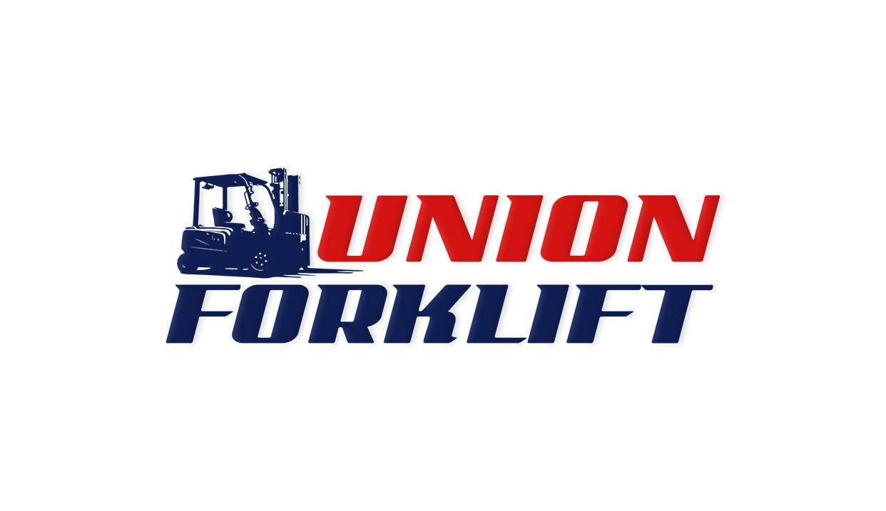
Instead of relying on a generic industrial symbol, the design uses a recognisable forklift silhouette that immediately connects the logo with the company’s business activity.
This is particularly suitable for a company involved in:
- forklift sales
- forklift rental
- forklift servicing
The symbol gives viewers a quick understanding of the business before they even read supporting information.
Because the forklift is integrated closely with the wordmark, the visual mark and company name work together rather than appearing as two unrelated elements.
Using the Client's Forklift Reference as Direction
The client specifically asked for the forklift to guide the design direction and provided a HELI forklift image for reference.
The brief also stated that the HELI wording should not appear in the final identity and that the finished logo should instead feature UNION FORKLIFT.
The finished logo therefore retains the strong forklift association while presenting the company’s own name as the main brand.
This creates a clearer identity for Union Forklift while keeping the visual connection to the industry.
Bold Typography for an Industrial Business
The client specifically requested bold typography.
The final wordmark reflects that requirement through heavy, forward-leaning lettering that gives the logo a strong and energetic industrial appearance.
The typography complements the forklift symbol because both elements communicate:
- strength
- movement
- machinery
- operational activity
A lighter or decorative typeface would have created a very different visual character and would not have aligned as closely with the client’s stated preference.
The bold lettering also helps the company name remain visible when the logo is reproduced at different sizes.
Red, Blue and White Colour Direction
The colour direction came directly from the client’s brief.
The client requested:
Red, Blue and White
and referenced the colour tone used in their existing name card.
In the finished logo, red creates immediate emphasis on the upper portion of the company name.
Dark blue is used for the forklift symbol and the lower typography, creating contrast and a stronger industrial foundation.
White provides a clean background that allows both colours to remain highly visible.
This colour combination also creates continuity with the company’s existing visual materials rather than introducing an unrelated new palette.
Building Recognition Through a Symbol and Wordmark
The final identity combines two main elements:
Forklift symbol
and
UNION FORKLIFT wordmark
This approach allows the business activity and company name to be communicated together.
The forklift symbol provides the industry reference, while the wordmark carries the main brand recognition.
For an industrial business, this can be particularly useful because the logo may need to appear in both visual and practical settings.
The design does not depend on a tagline or secondary message because the forklift graphic already gives strong context to the company’s activity.
Designing for Practical Business Applications
A forklift company may need its logo to work across many different physical and digital applications.
Possible uses include:
- forklifts and equipment
- service vehicles
- warehouse signage
- staff uniforms
- quotations
- invoices
- websites
- social media
- brochures
- name cards
- exhibition materials
The simple structure, bold typography and recognisable silhouette help the identity remain clear across both small and large applications.
These characteristics can help the identity remain visible when reproduced at both smaller and larger sizes.
Keeping the Logo Relevant to the Business
One of the strengths of the concept is that the logo directly reflects the company’s core business.
The client did not ask for an abstract identity.
Instead, the brief clearly indicated that forklift imagery should form part of the design.
The final identity follows that direction while keeping the forklift illustration simplified enough to function as part of a corporate logo.
This balance allows the logo to remain industry-specific without becoming overly detailed.
Businesses interested in the broader role of branding can also read our guide on why a good logo matters for your business.
Extending the Identity Across Corporate Collateral
Once the core logo is established, the same branding can be extended across other materials.
For a forklift sales, rental and servicing company, this could include:
- name cards
- brochures
- quotation templates
- vehicle branding
- signage
- service documents
- websites
- exhibition banners
Using the same logo, colours and typography consistently helps create stronger recognition across different customer touchpoints.
For businesses planning their branding budget, our logo design cost in Singapore guide explains factors such as concepts, revisions and additional branding requirements.
Final Logo Design Direction
The completed identity brings together:
- a recognisable forklift symbol
- the UNION FORKLIFT wordmark
- bold typography
- red, blue and white branding
- a compact horizontal composition
- a clear industrial and forklift-related visual direction
The final logo closely reflects the client’s supplied brief while giving the business a clear and recognisable identity.
Rather than using an unrelated abstract concept, the logo directly communicates the company’s connection to forklift sales, rental and servicing.
Visitors looking for more examples of identity work created by the Subraa Team can explore our logo design portfolio.
Logo Design for Industrial Businesses in Singapore
Industrial companies often need branding that can work across both corporate communication and practical physical applications.
A logo may appear on a website, business card or brochure, while also being used on machinery, vehicles, uniforms or signage.
That makes clarity, scalability and relevance especially important.
For this project, the client’s requested forklift imagery, bold typography and existing red, blue and white branding guided the overall visual direction.
The Subraa Team creates custom logo identities for Singapore businesses based on their industry, supplied requirements and intended brand direction.