
Logo Design for a Property & General Services Company in Singapore
Category:
Published Date: Sep 28, 2026
General Services Logo Design Singapore: Project Overview
This general services logo design Singapore project was developed for a business offering property care, cleaning, painting, handyman and other general services. Creating a logo for a business offering several different services presents an interesting branding challenge. The identity needs to communicate the nature of the company without trying to represent every individual service within one complicated logo.
For this project, the Subraa Team was approached to create a logo for a Singapore business operating across property care and general services.
The company provides a broad range of services for houses and shops, including professional and general cleaning, painting, handyman works, curtain dry cleaning, jet washing, moving services, disposal services and aircon-related services.
This meant the logo needed to communicate more than a single service category.
Rather than designing an identity that looked specifically like a cleaning company, painting contractor or handyman business, the objective was to create a broader visual identity that could represent the company's range of property and general services.
As part of our logo design services in Singapore, the Subraa Team develops each visual direction around the nature of the business, its services and the branding requirements provided by the client.
Understanding the Client's Logo Brief
Before beginning the design direction, the client provided information about the business, its services and the type of visual elements they wanted to explore.
The client's preferred imagery included:
- cleaning-related elements
- handyman tools
- painting elements
- curtain-related references
These preferences reflected the company's core service activities and provided the starting point for developing the logo concept.
The client was flexible regarding typography and did not specify any visual elements or colours that needed to be avoided.
This gave the design greater flexibility while still keeping the identity connected to the company's actual services.
A business logo needs to do more than simply look attractive. It also needs to help establish a recognisable and consistent visual identity across different customer touchpoints. Businesses developing a new identity can also read our Why a Good Logo Matters for Your Business guide for a broader look at the role a logo plays in branding and business recognition.
Creating an Identity for Multiple Services
One of the main considerations when designing a logo for a multi-service business is avoiding visual clutter.
A company offering cleaning, painting, handyman work, moving, aircon services and several other solutions could potentially use many different symbols. However, placing an individual icon for every service into a logo can quickly make the identity difficult to recognise, particularly when it is displayed at a smaller size.
The design therefore needed a visual structure capable of representing the business more broadly.
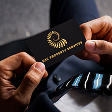
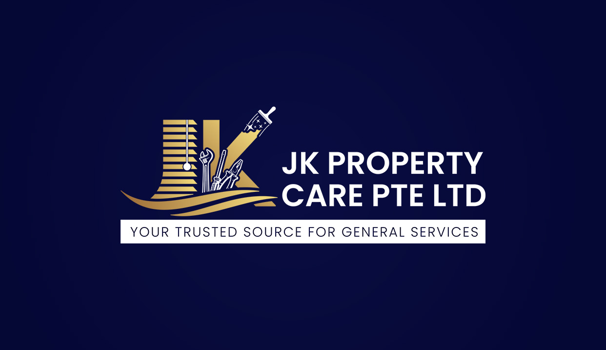
The finished identity places strong emphasis on the company's initials while incorporating property and service-related visual cues around the letterform.
The building-inspired outline helps establish the property-related nature of the business, while maintenance and service elements help communicate the company's practical, hands-on offering.
This combination allows the identity to represent the overall business rather than limiting the brand to only one service.
Incorporating Property and Maintenance Elements
The visual concept combines several ideas into a unified logo mark.
Property-inspired architectural lines provide immediate visual context, while cleaning, painting and maintenance references reinforce the service-oriented nature of the business.
A paint roller is incorporated into the composition together with other general service-related imagery, helping the logo communicate that the company handles practical property care and maintenance work.
Instead of positioning these elements separately around the company name, the imagery forms part of the overall identity.
This helps the logo remain recognisable as one visual mark.
Blue and Gold Colour Direction
Colour preferences were provided as part of the original logo brief.
The client specifically requested:
Blue and Gold
These colours became an important part of the visual direction.
The darker blue creates a professional foundation for the identity, while the gold provides contrast and helps highlight key portions of the logo.
The combination creates a distinctive contrast while giving the identity a professional and established visual character.
Most importantly, the colour palette follows the client's stated preference rather than being selected purely for stylistic reasons.
Using Initials to Build a Recognisable Brand Identity
The initials form the central element of the logo.
Using prominent initials gives the business a compact and identifiable brand mark that can work independently from the full company name when required.
This type of identity can be particularly useful for service companies because the logo may eventually appear across many different applications, including digital marketing materials, uniforms, quotations, invoices, vehicles, signage, social media and printed collateral.
The large letterforms also help maintain recognition even when the logo is reproduced at smaller sizes.
The overall complexity of a logo, number of concepts required, supporting brand materials and design requirements can also influence the project scope. Businesses planning their branding budget can refer to our Logo Design Cost in Singapore guide for more information about logo design pricing and the factors that can affect cost.
Typography and Company Name
The client's questionnaire did not specify a required typography style and indicated flexibility regarding the font direction.
The resulting identity therefore uses clear, strong typography that complements the visual symbol without competing with it.
The company name remains easy to identify alongside the main logo mark, allowing the symbol and business name to function together as a complete identity.
Tagline Direction
The client initially proposed the tagline:
“Your trusted source for General Services”
and was also open to alternative suggestions.
This further confirmed that the company wanted to position itself as a broad general services provider rather than being associated with only one area such as cleaning or handyman work.
That positioning influenced how the logo needed to communicate versatility.
Designing for a General Services Business
For a business providing several property-related services, the logo has to remain relevant even as individual services become more or less important over time.
A narrowly focused cleaning logo, for example, could become restrictive if the business later wanted to place greater emphasis on painting, maintenance or other property services.
Building the identity around the company's initials and overall property-service positioning gives the brand greater flexibility.
The service-related elements provide context, while the central identity remains the business itself.
Final Logo Direction
The completed logo brings together:
- a prominent initial-based identity
- property-inspired imagery
- maintenance and service-related visual elements
- the client's requested blue and gold colour direction
- clear supporting typography
The result is a recognisable corporate identity created specifically around the client's multi-service business model.
Rather than representing only one individual service, the design provides a broader visual foundation that can support the business across different property care and general service offerings.
Visitors looking for more examples of identities created by the Subraa Team for businesses across different industries can explore our logo design portfolio.
Logo Design for Singapore Service Businesses
Every business has a different combination of services, customers and branding requirements.
A professional logo should therefore be developed around the actual nature of the business rather than applying the same visual formula to every company within an industry.
For this project, the client's service range and original design preferences guided the creative direction, from the imagery incorporated into the concept to the blue and gold colour combination.
The Subraa Team creates custom logo identities for Singapore businesses based on their requirements, industry, services and intended brand directio.