
Flyer Design for a Storage Services Company in Singapore
Category:
Published Date: Dec 29, 2024
Storage Services Flyer Design Singapore: Project Overview
This storage services flyer design Singapore project was developed for a company providing storage, transport and packing solutions for both household and business customers.
The service offering shown in the flyer covers several areas:
- door-to-door transport
- furniture and household item storage
- packing and packing materials
- document storage for businesses
- document / A4 box storage
- pallet storage
- vault storage
The client’s questionnaire also confirmed that the company serves both B2C and B2B audiences, with professional businesses forming an important part of the B2B market.
The challenge was therefore not simply to promote one storage product. The flyer needed to communicate a broader storage service while keeping the various service categories easy to understand within a single vertical page.
For businesses requiring similar promotional collateral, the Subraa Team provides custom flyer design services in Singapore for products, services, promotions and business marketing.
Understanding the Client's Flyer Brief
The client provided clear direction for both the visual style and messaging.
The flyer needed to:
- use the StorkSHIP logo and tagline where possible
- follow the existing logo colours
- incorporate green
- create contrast between the company and competitors
- feel friendly and affordable
- communicate simplicity and transparency
- work for both household and business customers
- use a vertical orientation
- feature storage options clearly
The company’s key selling points were also specifically provided as:
FREE Video Surveyor to assist with your Packing and Storage needs
Simple and Easy Storage Service
Lowest and Transparent Pricing
Personalised to your needs
These points became an important part of how the flyer communicates the service rather than simply listing storage categories.
Presenting Household and Business Storage Together
One of the interesting challenges in this project was presenting services for two different customer groups within the same promotional material.
Household customers may be looking for:
- furniture storage
- household item storage
- packing assistance
- transport support
Business customers may instead require:
- document storage
- archive box storage
- pallet storage
- other organised storage solutions
The flyer therefore needed to remain broad enough to communicate the overall storage business while still giving individual services enough prominence.
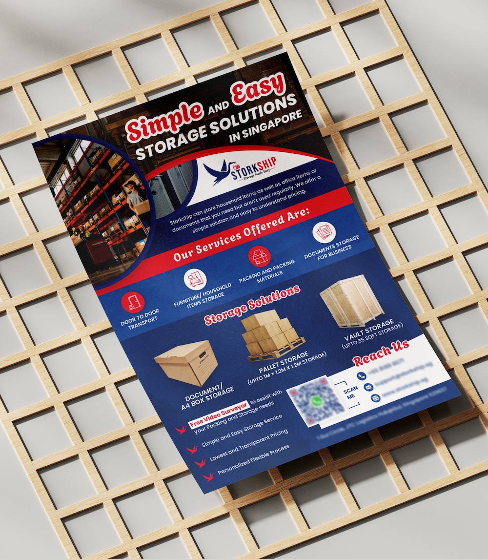
The layout achieves this by dividing the information into separate service and storage-option sections rather than treating all offerings as one continuous list.
Door-to-Door Transport
The service section includes door-to-door transport as one of the main offerings.
This is important because storage requirements often involve more than simply providing space.
Customers may also need assistance moving items from their current location into storage.
Including transport within the flyer helps position the company as a more complete storage solution rather than only a storage-space provider.
The transport service is represented through its own icon, allowing viewers to identify it quickly.
Furniture and Household Item Storage
The flyer also prominently includes furniture / household item storage.
This broadens the communication beyond commercial document storage.
Household customers may need temporary or longer-term storage when:
- moving home
- renovating
- decluttering
- relocating
- managing excess household items
The design does not need to explain every possible use case within the flyer itself.
Instead, the clear service label and visual icon communicate that household storage forms part of the overall service range.
Packing and Packing Materials
Another visible service is packing and packing materials.
This complements the storage offering because customers may need help preparing items before they are transported or stored.
Including packing support gives the flyer a more complete service proposition.
The customer can understand that the business may assist not only with storage space but also with preparing items for the storage process.
This also works well with the client’s positioning around making storage simple and easy.
Document Storage for Businesses
Business document storage forms another important part of the flyer.
The client specifically identified this as a key B2B requirement and asked that A4 box imagery and different storage options be shown.
Potential B2B customers identified in the brief included:
- law offices
- auditors and audit firms
- dentist offices
- small and medium-sized businesses
The client described the B2B audience as companies with up to around 100 staff.
Showing document storage within the same flyer helps the company communicate that its solutions extend beyond household storage.
Document / A4 Box Storage
The Document / A4 Box Storage section gives business customers a more specific example of how files and records can be stored.
The client explicitly requested an A4 box image for the B2B presentation.
This makes the service more tangible.
Rather than using the generic phrase “document storage” alone, the visual shows a familiar storage format that professional offices may already use for archived records.
That can help prospective customers connect the service directly to their own office requirements.
Pallet Storage
The flyer also presents Pallet Storage.
This introduces a larger-scale storage option and shows that the company is not limited to small document boxes or household items.
Pallet storage can visually communicate the ability to accommodate larger quantities or business inventory.
Including it alongside A4 box storage helps demonstrate that the company provides different storage formats depending on customer requirements.
Vault Storage
A third storage option shown is Vault Storage.
The flyer gives this option its own visual treatment rather than hiding it within a general list.
Together, the three storage formats:
A4 Box Storage
Pallet Storage
Vault Storage
give viewers a quick overview of the different solutions available.
This strengthens the flyer because customers can see specific options rather than being asked to interpret a generic “storage solutions” claim.
Communicating a Simple and Easy Storage Service
The client specifically wanted the brand to feel:
Simple
Easy
Affordable
Transparent
The main headline:
Simple and Easy Storage Solutions in Singapore
directly reflects that positioning.
This is stronger than beginning with technical warehouse terminology because it communicates the customer benefit first.
The headline tells readers that the service is intended to reduce complexity.
The detailed storage options can then follow once the main proposition has been established.
Highlighting the Free Video Surveyor
One of the client’s key differentiators was:
FREE Video Surveyor to assist with your Packing and Storage needs.
This message appears toward the lower section of the flyer.
Giving it dedicated prominence helps distinguish the service from a basic self-storage offer.
Rather than requiring customers to work out their storage requirements independently, the message suggests additional assistance during the enquiry process.
This is precisely the kind of differentiator that deserves more prominence than generic promotional wording.
Transparent Pricing and Personalised Service
The other client-supplied selling points included:
Lowest and Transparent Pricing
and
Personalised to your needs.
These messages are grouped with the broader service benefits.
This helps the flyer communicate not only what the company offers but also how it wants the service experience to be perceived.
That distinction matters in a competitive service industry.
Price transparency and flexibility may be important considerations for customers comparing several storage providers.
Red, Blue and Green Brand Direction
The client requested the flyer to retain the existing logo colours plus green.
The design therefore uses dark blue and red prominently across the flyer, supported by additional accent colours.
Dark blue provides the main visual foundation.
Red is used for:
- headings
- service icons
- curved section dividers
- promotional callouts
White provides contrast and makes the information easier to distinguish.
The visual direction keeps the flyer connected to the existing brand rather than introducing an unrelated promotional style.
Creating Contrast with Competitors
The client specifically asked for the design to help draw contrast between StorkSHIP and competitors.
The flyer supports this primarily through messaging rather than making unsupported competitor comparisons.
The strongest differentiating statements are:
- free video survey support
- simple and easy service
- transparent pricing
- personalised solutions
- multiple storage options
- transport and packing support
These give the reader more concrete reasons to understand the company’s positioning.
Warehouse Photography and Storage Imagery
Warehouse photography near the upper section immediately establishes the context of the business.
Further down, individual images represent specific storage formats.
This gives the design two layers of imagery:
warehouse environment for overall context
and
storage products/options for detailed understanding.
The combination is more informative than relying only on generic warehouse photography.
Using Icons to Organise Services
The flyer uses individual icons for the main service categories.
This is particularly useful because several different services need to coexist within a limited area.
The icons make it easier to differentiate:
- transport
- household storage
- packing
- business document storage
without requiring long descriptions.
For a promotional flyer, this supports quick scanning.
Our article on tips to make your flyer design stand out also discusses how clear visual hierarchy and strong presentation help promotional materials communicate effectively. Posts ‹ #1 Premier Freelance We…
Building a Clear Visual Hierarchy
The flyer follows a logical information sequence:
Simple and Easy Storage Solutions
?
Company and service introduction
?
Services Offered
?
Storage Solutions
?
Customer benefits
?
Contact information
This structure means the viewer does not need to process everything at once.
The major message is introduced first, followed by increasingly specific information.
For a flyer containing numerous services, this type of hierarchy is particularly important.
Preventing a Service-Heavy Flyer from Becoming Cluttered
This project contains a substantial amount of information.
There are several service categories, multiple storage formats, selling points and contact methods.
Without careful organisation, that could easily make the flyer feel overcrowded.
The design separates these elements using:
- colour sections
- curved graphics
- icons
- photographs
- headings
- spacing
This principle also aligns with our article on flyer design mistakes to avoid, which specifically cautions against trying to pack everything into a flyer without sufficient hierarchy and breathing space.
QR Code and Contact Information
The lower-right portion of the flyer includes the primary contact area together with a QR code.
This gives customers several ways to move from the printed promotional material to an enquiry.
Depending on the viewer’s preference, they can use:
- phone
- website
- QR access
This is particularly useful for a storage business because customers may need to discuss storage volume, transportation or packing requirements before deciding what solution they need.
Why Flyers Work for Service Promotion
A flyer can be particularly suitable for a business with a local service audience because several offerings can be communicated within one physical or digital promotional piece.
Your existing article on reasons to use flyers to promote a business discusses flyers as a tangible and locally distributable marketing format.
For a storage company, the format makes it possible to present the company’s services, storage options, differentiators and contact information together.
Final Flyer Design Direction
The completed flyer brings together:
- household storage
- furniture storage
- business document storage
- door-to-door transport
- packing and packing materials
- document / A4 box storage
- pallet storage
- vault storage
- free video survey messaging
- transparent pricing positioning
- personalised service messaging
- red and blue brand styling
- QR code and contact information
The result is a broad storage-services flyer rather than a flyer focused on only one type of storage.
It communicates the company’s ability to support both household and business customers while giving individual storage options enough visibility to be understood quickly.
Flyer Design for Storage and Service Businesses in Singapore
A service-based flyer needs to communicate more than a list of features.
Potential customers also need to understand the range of services, the practical benefits and how to make an enquiry.
For this project, the Subraa Team developed a flyer that brings household storage, business storage, transport, packing and multiple storage formats together within one organised promotional layout.