
Restaurant Opening Flyer Design for an F&B Business in Singapore
Category:
Published Date: Apr 08, 2024
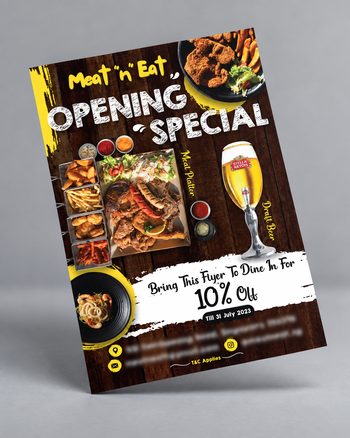
Restaurant Opening Flyer Design Singapore: Project Overview
This restaurant opening flyer design Singapore project was developed for an F&B business launching a new store.
The main purpose of the flyer was straightforward: create awareness around the opening and give customers a reason to visit.
The client’s promotion was:
Bring the flyer to dine in for 10% off
with the offer designed to encourage physical store visits during the opening period.
The flyer also needed to highlight two of the outlet’s key food-and-drink attractions:
- meat platter
- draft beer
The client specifically described the meat platter and beer combination as suitable for gatherings or simply chilling out.
This gave the Subraa Team a clear promotional direction: the design had to feel energetic, casual and food-focused rather than formal or premium.
For businesses planning similar promotions, the Subraa Team provides flyer design services in Singapore for openings, events, promotions and other marketing campaigns.
Understanding the Client's Flyer Brief
The client provided a simple but focused brief.
The flyer needed to:
- promote the new store opening
- create awareness
- communicate a 10% dine-in promotion
- ask customers to bring the flyer to redeem the offer
- highlight the meat platter
- feature draft beer
- maintain a friendly, affordable and fun tone
- use black and yellow
- use a vertical layout
- target customers aged 16–50
The client also had some food imagery available and was open to the addition of suitable free images if needed.
This meant the design direction could remain highly visual rather than depending on long-form copy.
Building the Flyer Around the Opening Promotion
The strongest message on the flyer is:
OPENING SPECIAL
This gives the promotion immediate visibility.
The flyer does not make the customer search for the main purpose of the design.
A viewer can understand within seconds that:
- the outlet is opening
- there is a special promotion
- food and drinks are part of the offer
- bringing the flyer provides a discount
That hierarchy is important for promotional design.
A store-opening flyer should not bury the offer below lengthy introductory copy.
Making the 10% Dine-In Offer Prominent
The client specifically wanted customers to receive:
10% off when they bring the flyer and dine in.
The finished design gives this promotion a large dedicated section near the lower part of the flyer.
The white promotional area creates strong contrast against the darker wooden background.
The words:
Bring This Flyer To Dine In For 10% Off
are therefore difficult to miss.
The discount percentage is especially large, helping it function as one of the strongest visual elements on the page.
This is an effective placement because the customer first notices the food and opening message, then sees the incentive to visit.
Highlighting the Meat Platter
The meat platter is one of the largest visual elements in the design.
This directly reflects the client’s intention to promote it as a key menu item.
Rather than displaying a small generic food photograph, the flyer gives the platter enough scale to communicate abundance and sharing.
The platter includes several meat and side items, visually supporting the client’s positioning around gatherings and casual dining.
The vertical “Meat Platter” label helps identify the featured product without interfering with the food image itself.
For an F&B flyer, strong food photography is often more persuasive than lengthy menu descriptions because customers can immediately visualise the dining experience.
Using Draft Beer as a Second Main Attraction
Draft beer forms the second major product feature.
The large beer visual balances the meat platter and reinforces the casual dining and social aspect of the promotion.
The client specifically mentioned:
meat platter and draft beer good for gathering or to chill.
That message is reflected visually rather than repeated as a long sentence.
The food and beer combination communicates a relaxed group-dining experience and gives the flyer a clear social character.
Food Photography as the Main Selling Tool
The flyer uses food photography throughout the composition.
Visible elements include:
- meat platter
- fried food
- fries
- salads
- sauces
- pasta
- draft beer
The food imagery fills much of the design, which is appropriate because the main purpose is to attract customers to dine in.
For restaurant marketing, the visual quality and prominence of food often determine whether the flyer feels appetising.
The Subraa Team therefore placed the food itself at the centre of the promotional story rather than relying mainly on text.
Black and Yellow Colour Direction
The client specifically requested:
Black and Yellow.
The finished design follows this direction strongly.
Yellow is used for:
- brand-style heading elements
- accent graphics
- labels
- selected promotional details
Black and very dark brown create the main background foundation.
White is introduced selectively for high-contrast typography and the promotional discount panel.
This combination gives the flyer a bold, energetic appearance while complementing the warmer tones of the food photography.
Rustic Wood Background for a Casual Dining Feel
The flyer uses a dark wooden background rather than a plain flat colour.
This adds texture and gives the design a more casual restaurant atmosphere.
The wood treatment works particularly well with:
- grilled meat
- fried dishes
- beer
- large sharing platters
It helps create a relaxed dining character rather than a formal fine-dining presentation.
This supports the client’s requested friendly, affordable and fun tone.
Typography with a Casual, Energetic Style
Several typographic styles are used strategically.
The brand name is presented in a rounded, playful style.
OPENING SPECIAL uses a bold, distressed font that feels more casual and energetic.
The promotional offer uses a hand-lettered style that helps differentiate it from the other information.
This combination creates personality without making the flyer difficult to understand.
The typography matches the informal dining atmosphere better than a purely corporate typeface would.
Creating a Strong Visual Hierarchy
The flyer follows a clear reading pattern:
brand
?
opening special
?
food and beer
?
10% discount
?
contact and location information
This hierarchy is one of the strongest aspects of the design.
The viewer does not have to read every piece of information to understand the promotion.
That matters for flyers, which are often viewed for only a few seconds.
Our existing article on tips to make your flyer design stand out is relevant here because strong imagery, contrast and hierarchy are important when competing for attention. Posts ‹ #1 Premier Freelance We…
Designing for a Broad 16–50 Audience
The client identified the target age range as:
16-50 years old.
That is a relatively broad audience.
The design therefore avoids being too youthful or too formal.
Instead, it relies on universally recognisable attractions:
- appetising food
- beer
- a discount
- a casual dining atmosphere
- a clear opening promotion
This makes the flyer suitable for younger diners, working adults and groups looking for an affordable social meal.
Using the Flyer as a Redemption Tool
This flyer is not only an awareness piece.
It also functions as a promotion redemption tool because customers need to bring the flyer to receive the discount.
That gives the physical flyer a direct commercial purpose.
The business can potentially track response informally by seeing how many customers present the flyer during the campaign period.
The design therefore needed to make the promotional condition unmistakable.
Showing the Promotion Period Clearly
The discount area includes an expiry:
Till 31 July 2023
This creates a clear campaign window.
Time-limited promotions can help make a flyer feel more actionable because customers understand that the offer is temporary.
The expiry date is separated visually from the main 10% message so it remains visible without competing with the discount itself.
Location and Contact Information
The lower part of the flyer includes the business’s location and social/contact information.
The client provided the address as:
431 Sembawang Road, Singapore 758396
The flyer also uses an Instagram reference rather than placing a phone number, which follows the client’s instruction not to include a phone number on the flyer.
This is a good example of adapting the contact section to the business’s preferred communication channels rather than automatically inserting every possible contact method.
Balancing Offer, Food and Branding
Promotional F&B flyers can easily become overcrowded.
There may be:
- restaurant branding
- food photos
- promotional copy
- discount conditions
- location
- social media
- expiry date
The design therefore needs clear prioritisation.
In this project, the Subraa Team keeps the strongest focus on:
opening special + food + 10% offer
while allowing the practical information to sit lower in the hierarchy.
This is more effective than giving the address or social handle the same prominence as the food and promotion.
Avoiding Common Flyer Design Problems
An opening flyer needs to remain promotional without becoming chaotic.
Our existing article on flyer design mistakes to avoid is particularly relevant to this type of campaign because too many competing fonts, weak hierarchy or an unclear offer can reduce the impact of a promotional piece. Posts ‹ #1 Premier Freelance We…
Here, the central offer remains clear despite the amount of food imagery.
The visual elements support the promotion rather than hiding it.
Flyer Marketing for a Restaurant Opening
Flyers can be particularly practical for a new restaurant or F&B outlet because they can be distributed around the surrounding neighbourhood, nearby businesses or pedestrian areas.
A time-limited offer can give recipients an additional reason to retain the flyer rather than discard it immediately.
Your existing article on reasons to use flyers to promote your business is also relevant to this project because the flyer combines local awareness with a direct promotional incentive.
Final Flyer Design Direction
The completed design brings together:
- restaurant opening promotion
- 10% dine-in discount
- meat platter imagery
- draft beer imagery
- multiple food visuals
- black and yellow client-requested colours
- rustic wooden styling
- casual typography
- campaign expiry date
- location and social information
- clear promotional hierarchy
The result is an F&B flyer designed to do more than announce a new opening.
It gives potential customers a clear visual reason to visit, shows the type of food experience being promoted and provides a specific discount incentive to encourage dine-in traffic.
Visitors can explore other promotional and graphic design projects through the Subraa portfolio.
Flyer Design for Restaurants and F&B Businesses in Singapore
Restaurant flyers need to communicate visually and quickly.
Food photography, pricing or promotions, location and a clear call to action can all influence whether the viewer takes the next step.
For this project, the Subraa Team created a flyer built around the actual campaign objective: raise awareness for a new store opening and encourage dine-in visits through a clearly presented 10% promotional offer.